
Sport Singapore's core purpose is to inspire the Singapore spirit and transform Singapore through sport. Through innovative, fun, and meaningful sporting experiences, the mission is to reach out to and serve communities across Singapore with passion and pride.
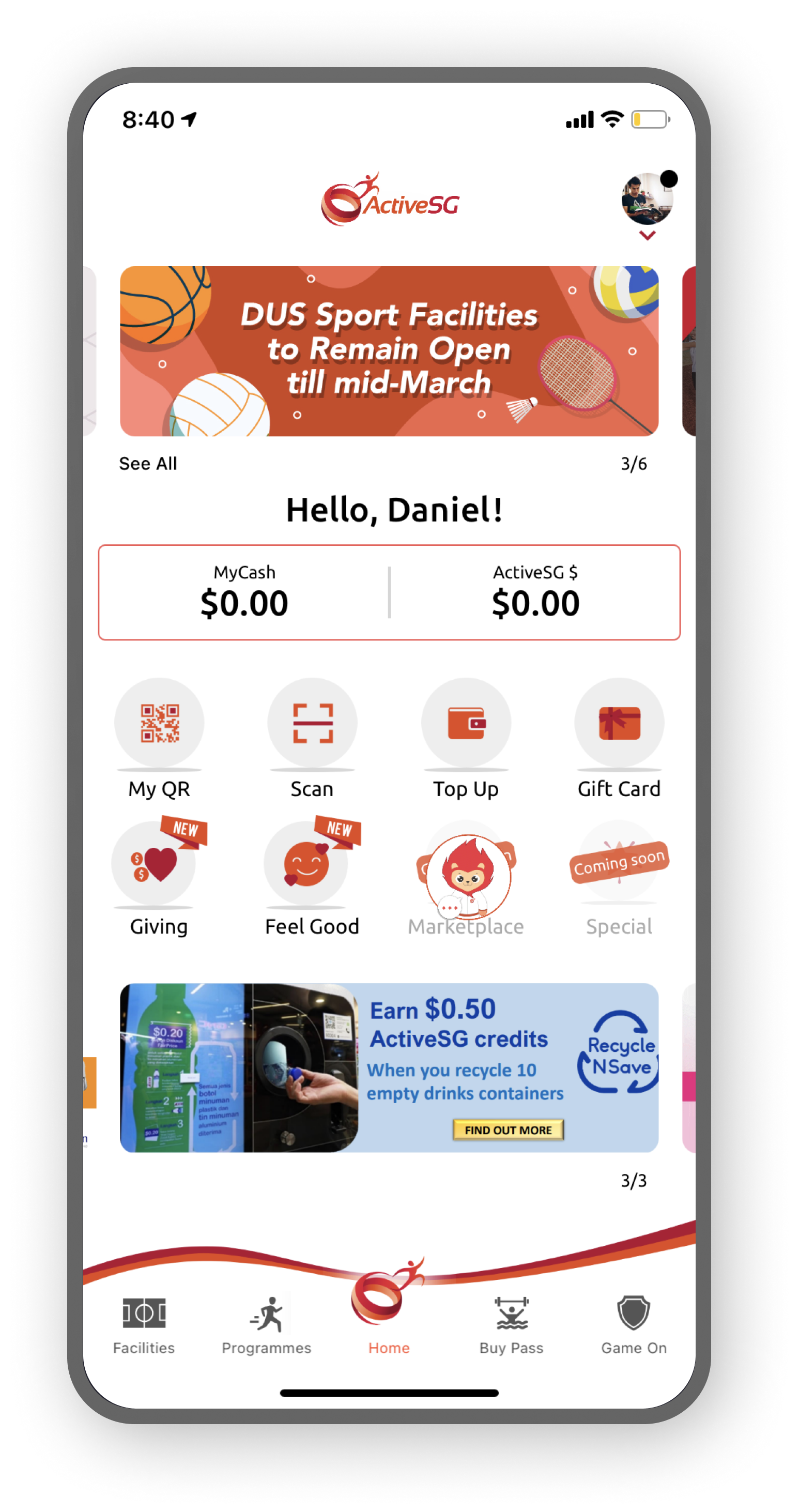
ActiveSG is SportSG’s portal for booking public sports facilities and sign up for public sporting events.
User's Goals and Needs
The user's thoughts and emotions during app interaction were compiled and translated into a journey map. The timeline highlights how the emotional state changed across each interaction. Based on these insights, "How Might We" (HMW) statements were developed to optimise the overall experience.
How might we help users find the most suitable venue and time to play their game/exercise?
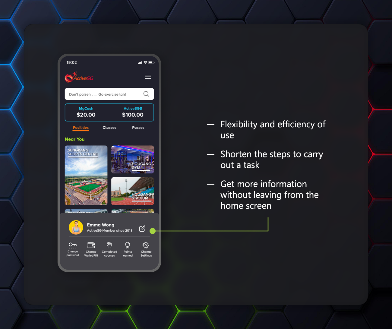
How might we streamline the navigation of a regular user's journey such that her experience is as efficient and to the point as potentially possible?
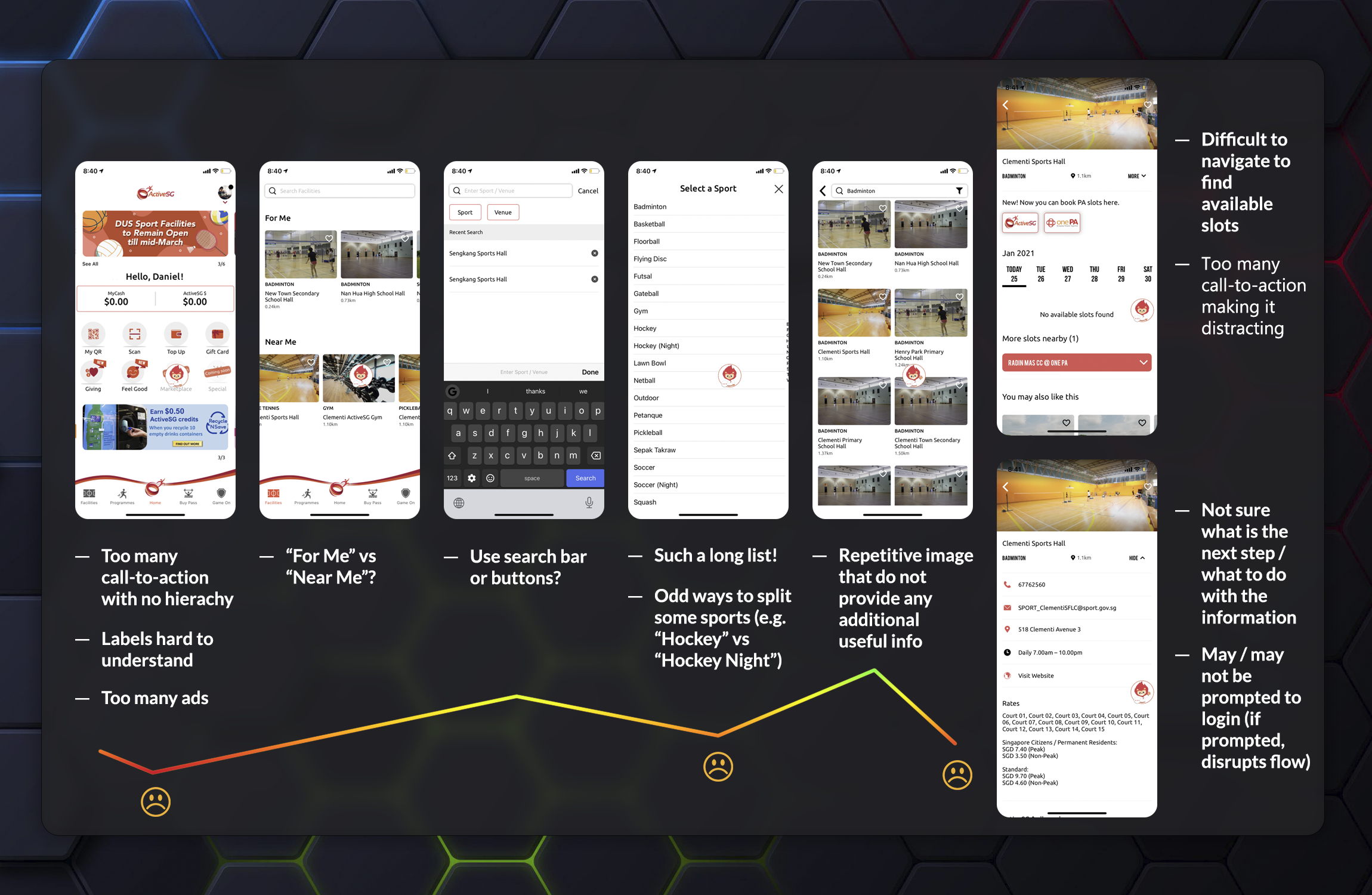
Customer Journey Map
Success with A Heart
Goals
Signals
Metrics
Happiness
- User satisfaction.
- Number of new users download.
- Ratings and reviews from users.
- Referral rates (the number of app download).
Engagement
- Connecting with people of the same industry.
- User activity.
- Amount of feedback / reviews from users.
- Number of booking made.
Adoption
- Features / components implemented successfully.
- User onboarding.
- Number of components used in new design.
- Number of time users booked the same facilities within a period of time.
Retention
- Daily search.
- Active users.
- App usage time.
- Number of pass purchased.
Task Success
- User goals completion.
- Users give positive feedback.
- Consistency in the implementation of the design system.
Success Metrics Using Google's HEART Framework
Defining the Key Design Principles
Before proceeding with the brand identity, the key design principles were first established. These principles were then organised into three main categories: Motivational, Intuitive, Inclusive and Human.
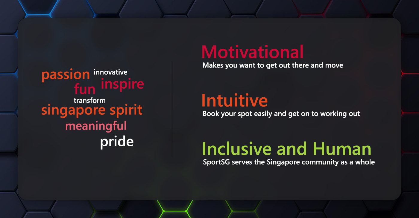
Key Design Principles
Tone and Voice Determination
To express the core brand values, the tone and voice were shaped to be casual, not too serious and not overly playful. It strikes an enthusiastic balance that sits between irreverent and respectful, conveying friendliness, helpfulness and inclusivity. After mapping the voice to the emotional needs of users, the resulting attributes emerged as thankful, friendly, encouraging, attentive and sincere.
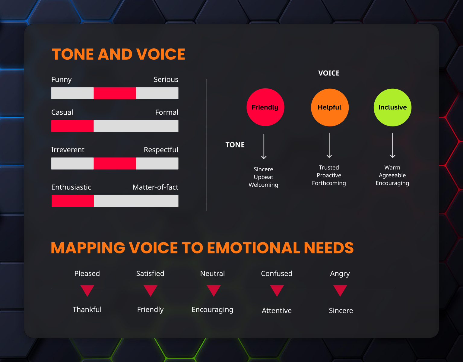
Tone and Voice
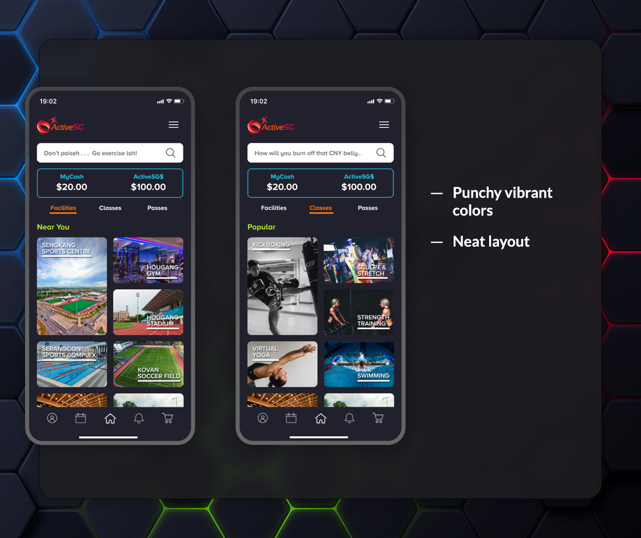
Color Pickups
The colors were primarily selected from the Sport Singapore and ActiveSG color schemes, with additional secondary colors added. All colors align with the organisation's branding. The variety of colors represents diversity and inclusivity, creating a vibrant, energetic, and dynamic vibe.
A dark theme will be used as the app background, allowing the bright colors to stand out and convey excitement and energy!
Dark mode reduces eye strain from prolonged exposure to bright screens. It also helps save battery and enhances the visual experience.
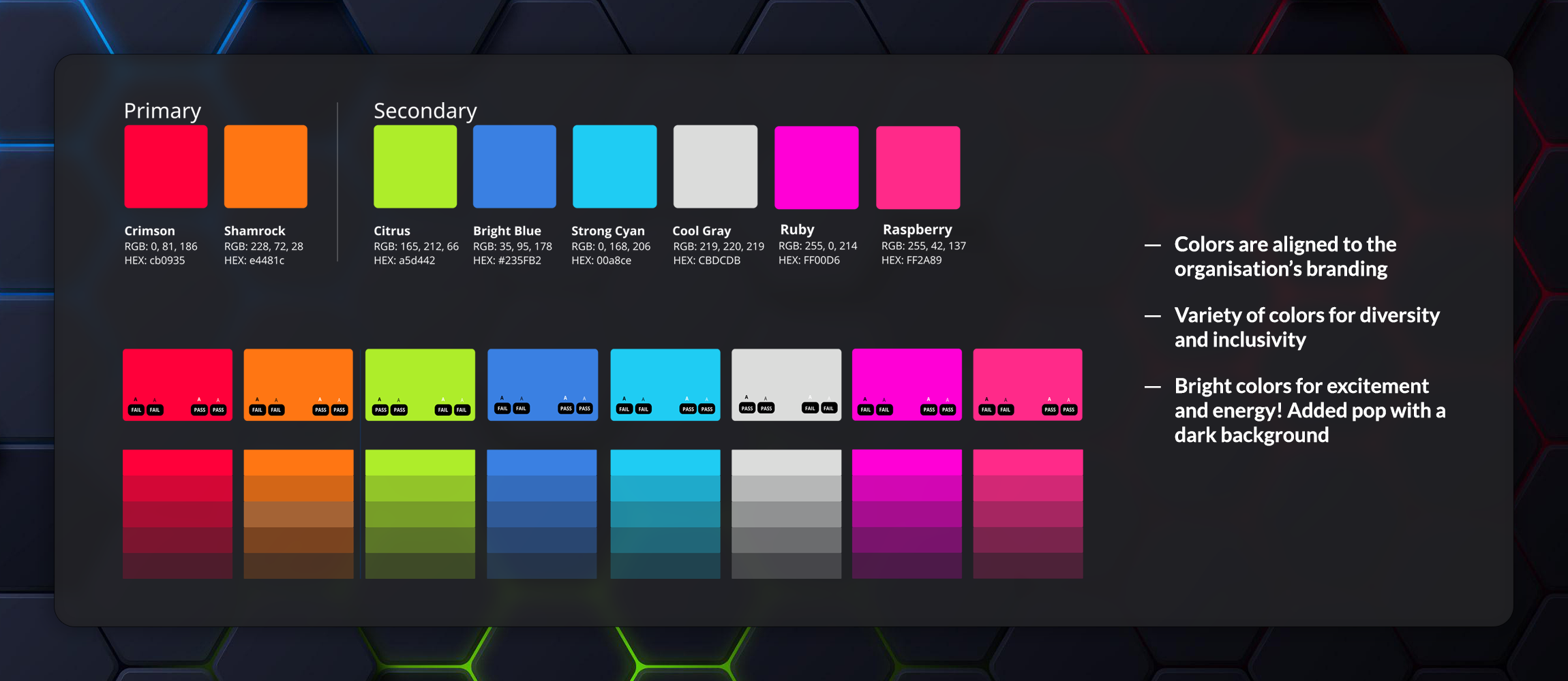
Color Pickups
Typography and Iconography
The typography focuses on readability, consistency, modernity, and cleanliness. Proxima Nova is used for headings, while Cereal is applied to buttons and body text.
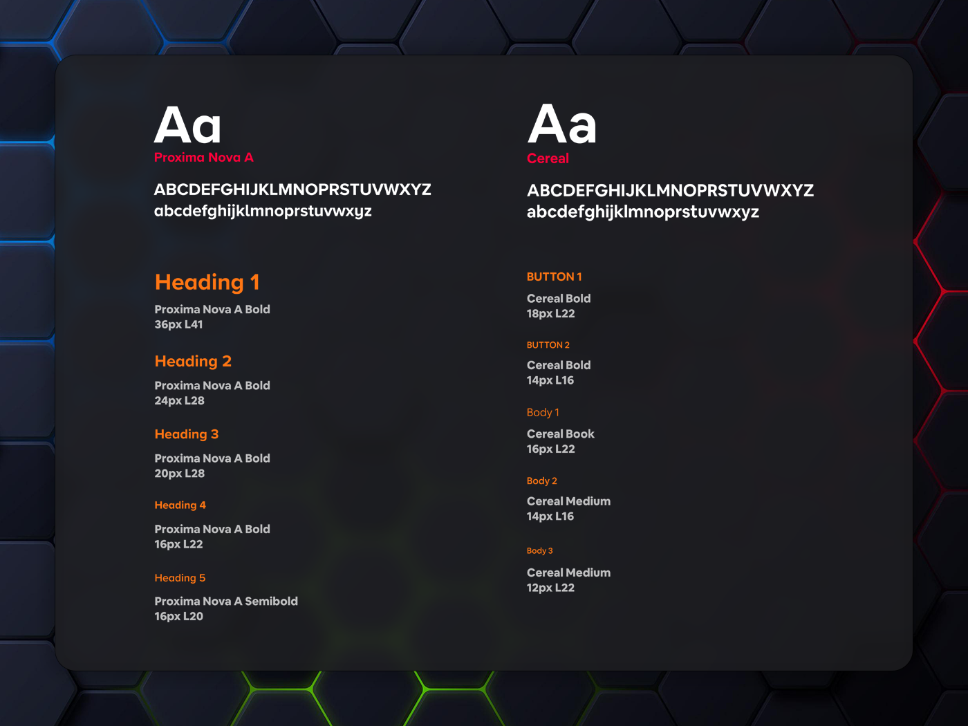
Usage of Typography
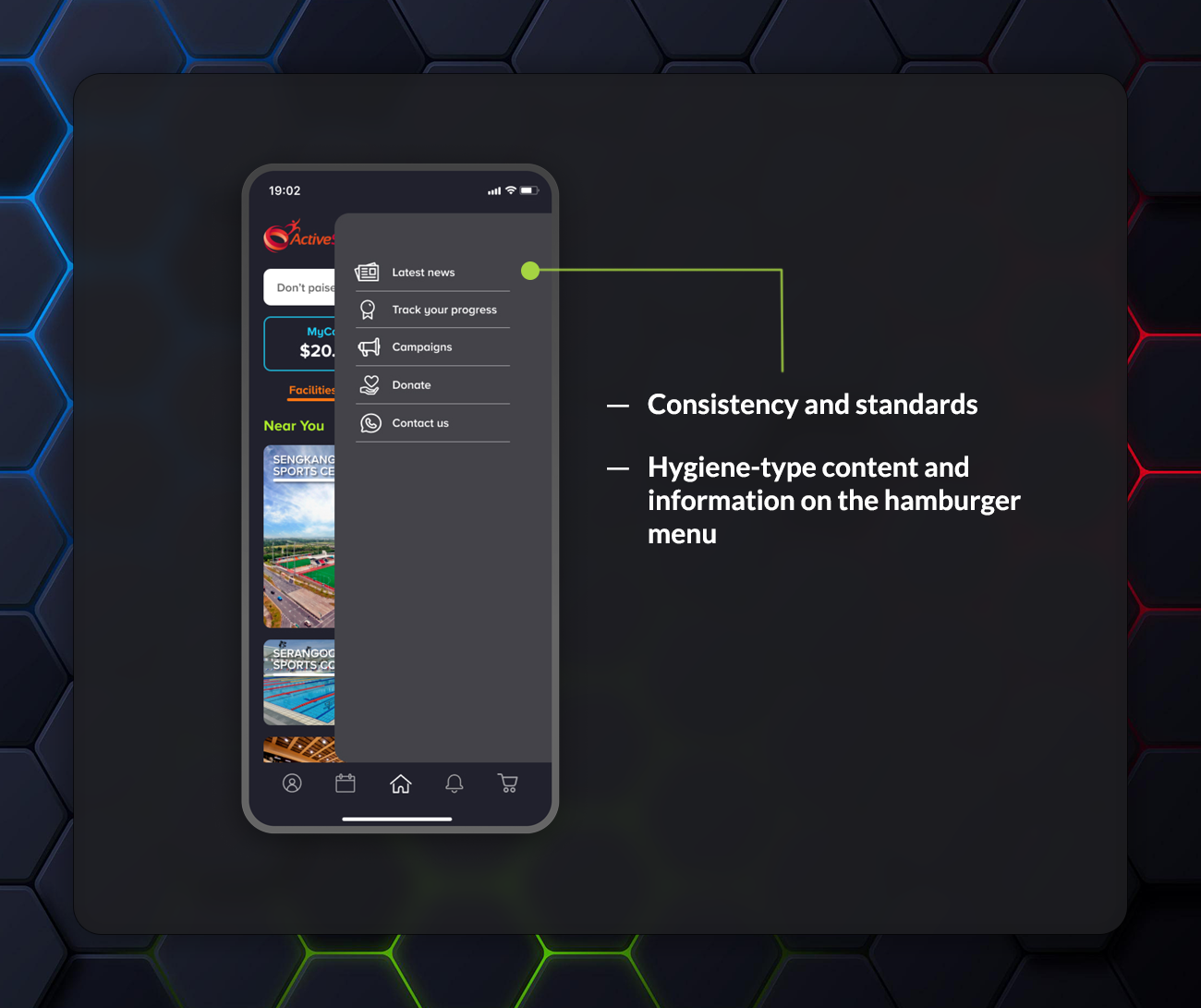
Since the design uses a dark theme, white outline icons were chosen to ensure clear visibility. This also maintains consistency by avoiding a mix of solid and outline icon styles.

Usage of Iconography
Components Prioritisation
The app was scanned to identify the key components. Once all components were noted, they were prioritised using a 2-by-2 matrix based on frequency and complexity. Most components within the green box were targeted to achieve significant improvements to the UI.
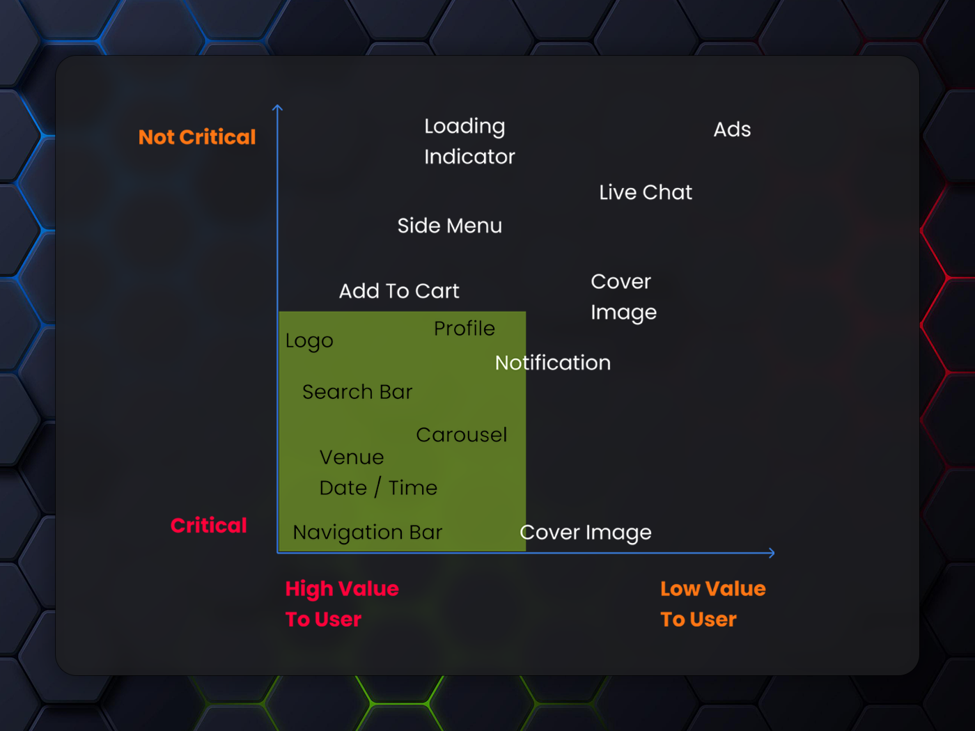
2 by 2 Matrix
Anatomy of a Component
Carousel Slider
Pattern — Use a larger font size for the title of the active item and a normal font size for inactive items. Place the image on top, followed by the labels.
Transition — Enlarge the box item, and display the distance label only when the item is active.
Flexible — Long text will wrap to the next line instead of being truncated.
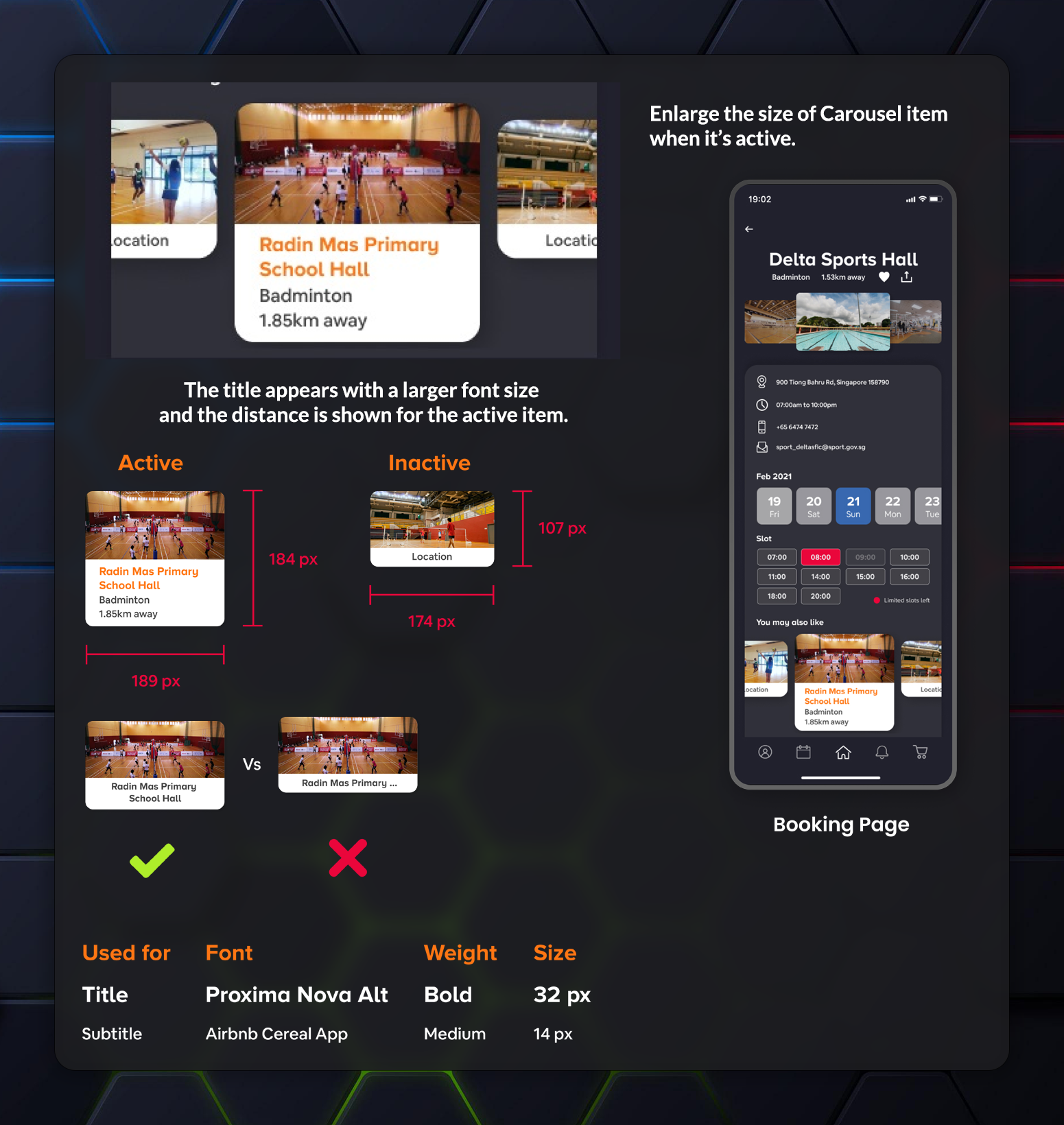
Carousel Slider
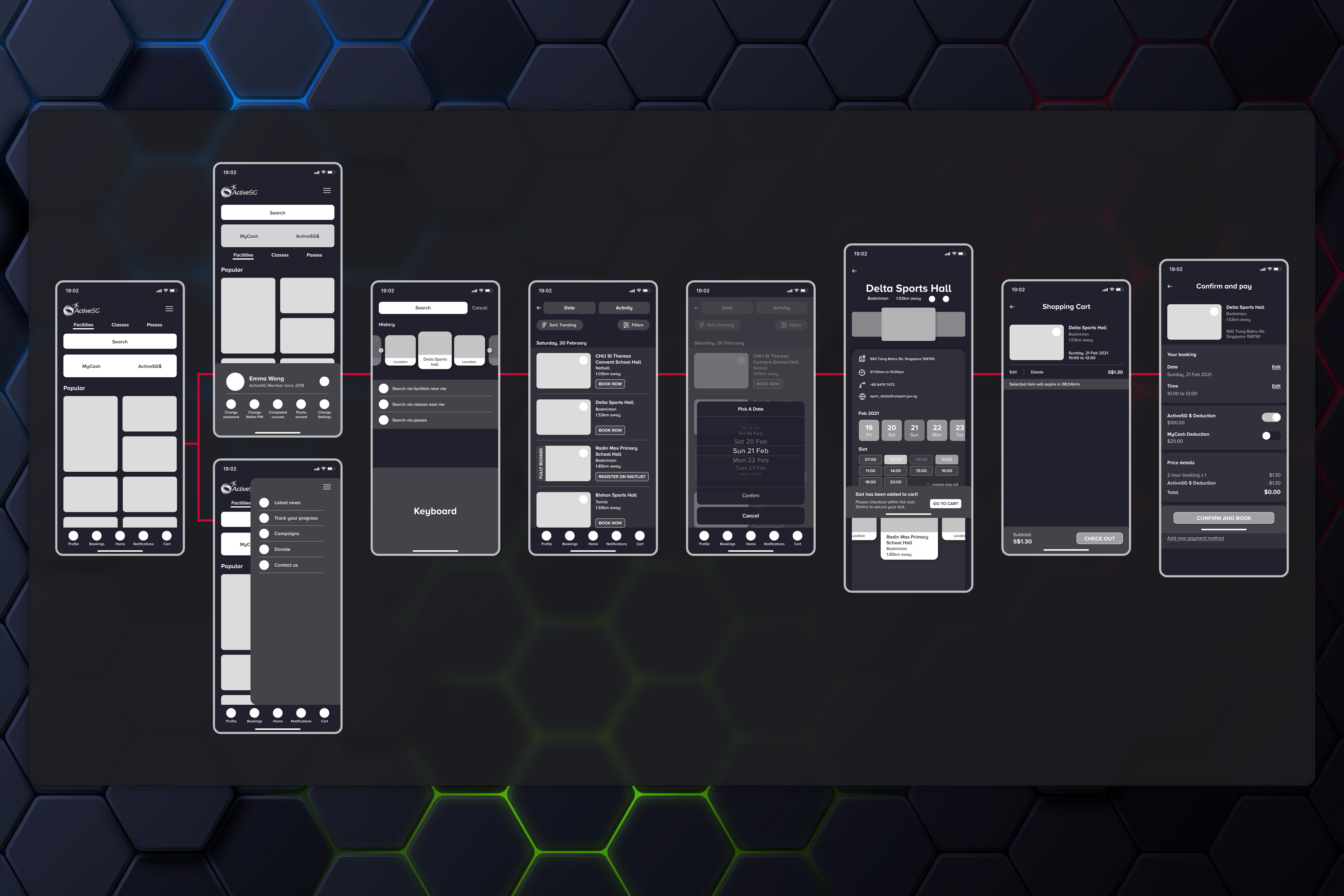
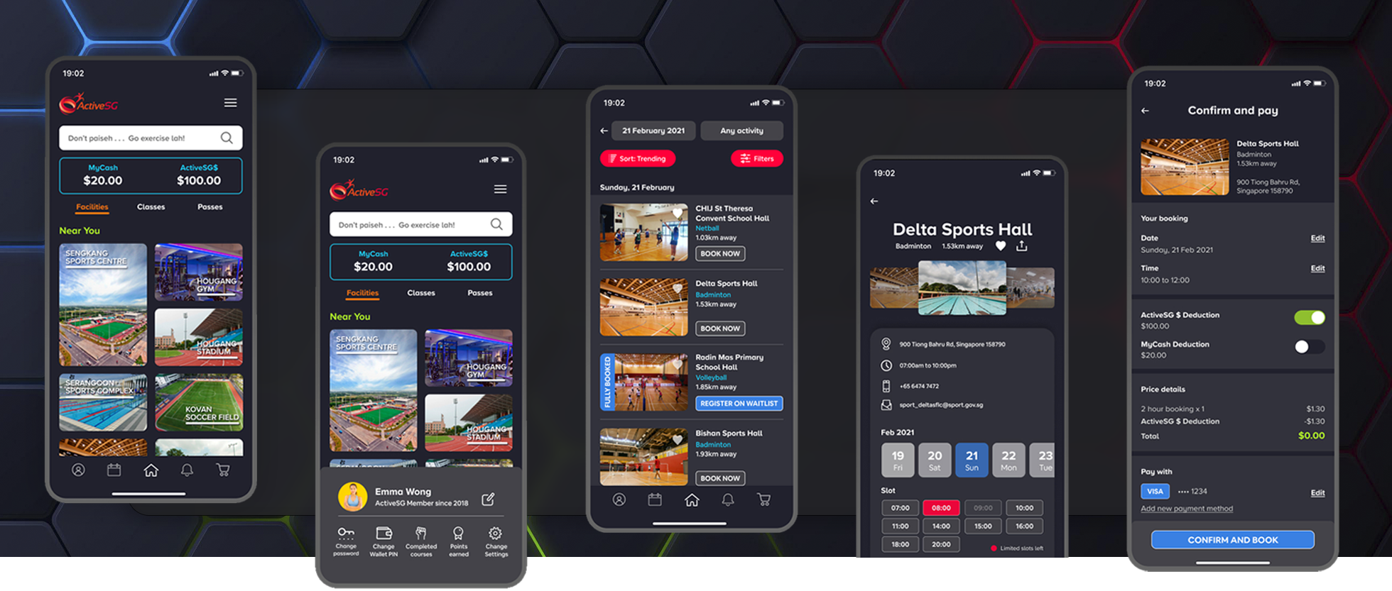
Low-fidelity Wireframes
The Wireflows were arranged based on the facility booking process. Wireframes were then designed to ensure alignment before developing the prototype. The wireframes helped maintain focus and prevented deviation from the original ideas.