What is Chope?
Chope is a real-time restaurant reservation platform that connects diners with partner restaurants. The name Chope is inspired by the Singlish term "Chope", commonly used in Singapore.
First started when people used tissue to book seats at food centres.
Chope’s mission is to connect all restaurants and diners through discovery, reservations and deals.
Why chose Chope as the App to Work On?
The Five Whys
- Personal — The UI navigation is not user-friendly, preventing users from revisiting.
- Design Issues — Visual clutter is present, and a redesign is needed to create more consistency.
- Impact to User — An unintuitive and misleading UI causes confusion for users.
- Impact to Business Mission — Poor reviews and misleading UI navigation cause users to miss out on good deals and lead to user frustration.
- What If It's Not Solved — Chope may fail to reach its target users and could lose returning users.
Here are some of the negative reviews of Chope from the App Store. Many users reported similar UI issues with the app. One feedback mentioned problems with the search filters, and several users commented negatively on the UI navigation for deals and other functions.
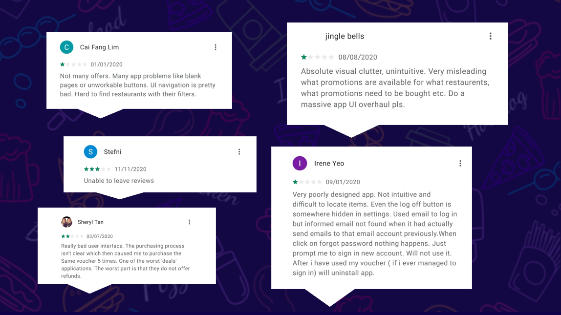
Reviews from App Store
The High Level Problem Statement
The Four Ws - Who, What, Where and Why
WHO Is Experiencing the Problem?
The primary users are busy individuals, such as working adults and families in Singapore. As many Singaporeans are food enthusiasts, this app was created to make restaurant reservations more convenient and efficient.
WHAT Is the Problem?
Feedback remarks on visual clutter, and users also comment that the deals navigation is misleading and unclear.
WHERE Does the Problem Present?
The problem is mostly found on the Home and Deals screens. Useful features such as food reviews, star ratings, and bookmark options are lacking, which could otherwise encourage more returning users.
WHY Does It Matter?
By improving the user experience, the app can encourage more returning users as well as attract new users to reserve dining venues and purchase promotional coupons.
Defining the Business Idea
After analyzing and researching the Chope website, the Business Model Canvas was created. Although Chope's customer segments include everyone in Singapore, the main target audiences are busy individuals such as working adults and families. Chope has also partnered with Google, Tripadvisor, and DBS to provide an all-rounded lifestyle experience.
The key activity on the app is to enable users to make reservations with just a few taps.
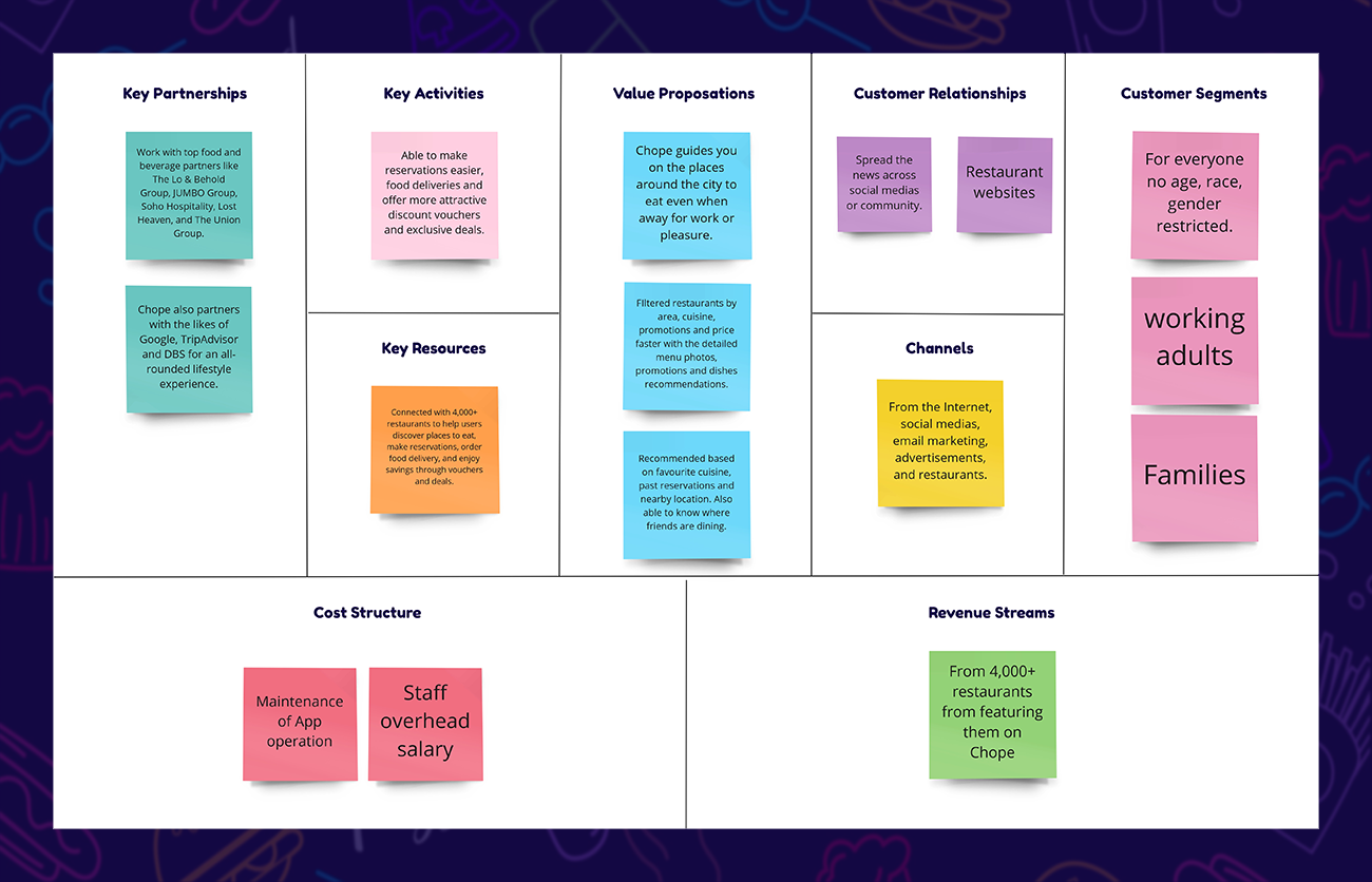
Business Model Canvas
Collecting Data from the Research
An Interview was conducted with three users who are foodies, including working adults and busy parents, who value a convenient and efficient way to reserve their dining venues.
Insights and findings include — Most users search for deals before deciding on a restaurant and wish that deals were more prominent so they do not miss them. Users also feel that Chope should have a review feature to help make quicker decisions about which restaurant to visit. Information about other food apps used by the participants led to the next step of competitor analysis.
An Affinity Map was created to organize the insights gathered into individual categories.
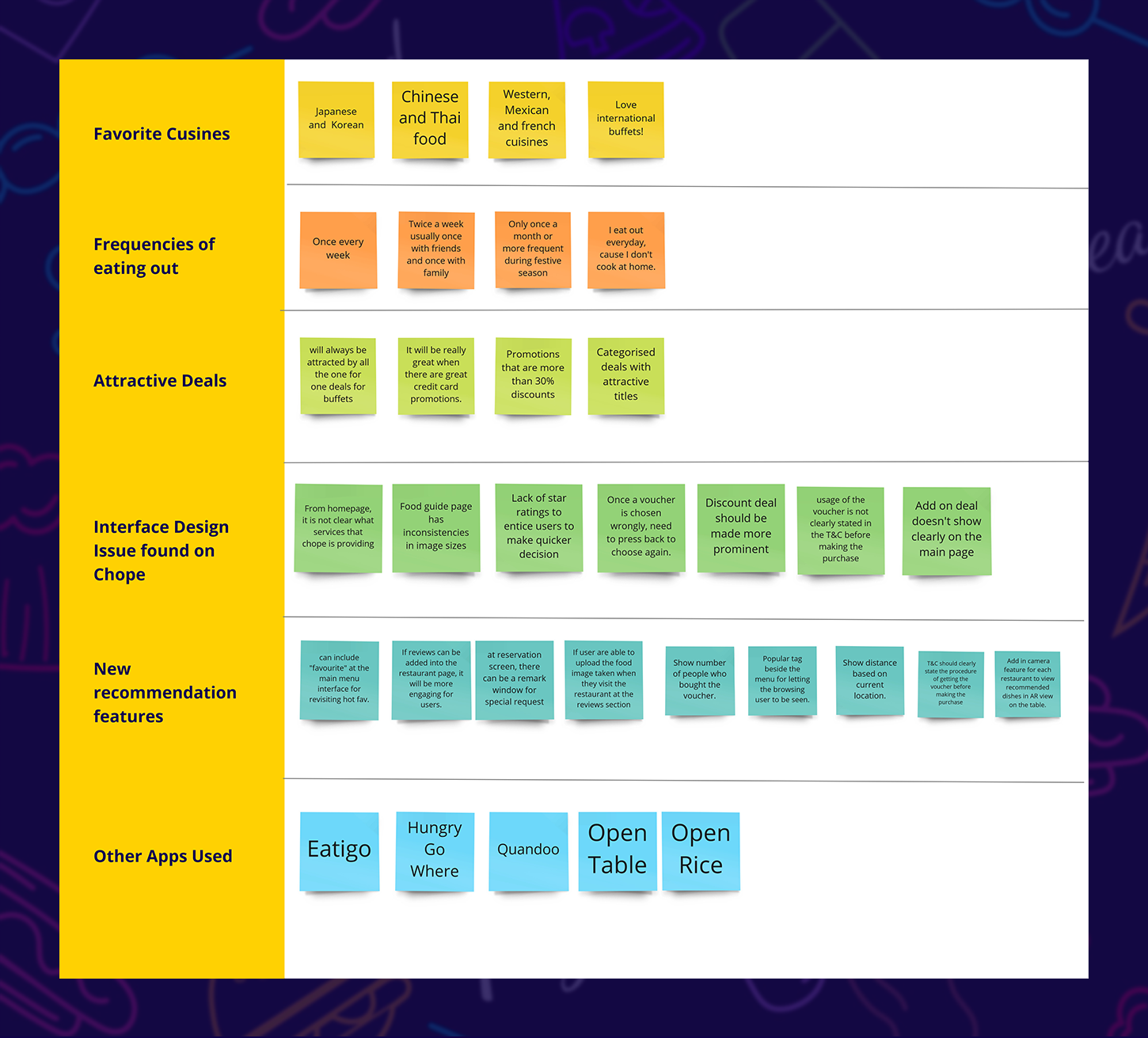
Insights And Findings Gathered On Our Affinity Map
Competitor Analysis
A comparison research was conducted among three other popular competitors. The results from the different apps shed light on the features required to provide a better experience for food lovers. After evaluating the Chope app, the necessary features were refined based on insights gathered from the comparison table.
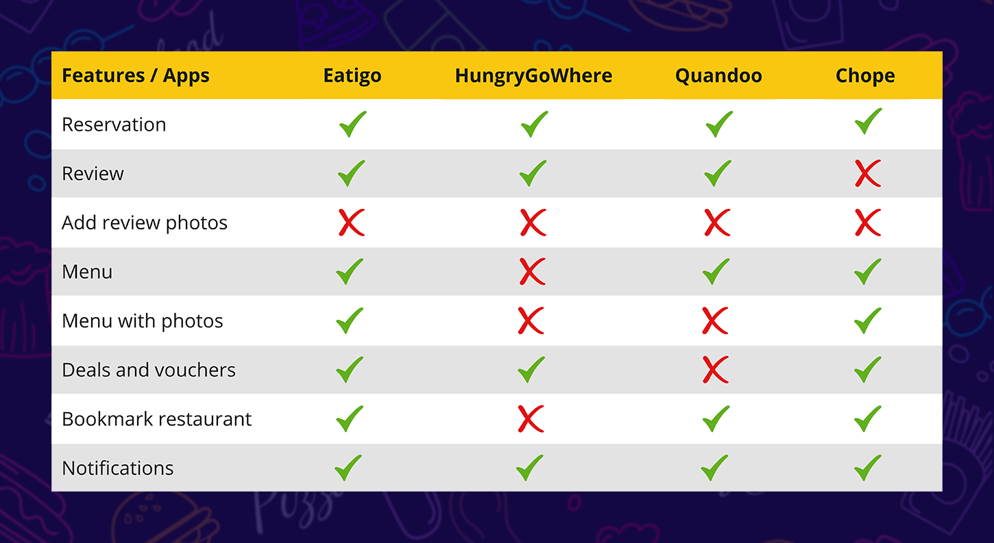
Competitor Analysis
Persona
A persona was created to represent a user that a food app should focus on. The persona is a 37-year-old marketing manager who is also a mother of two children. As a busy mother juggling work and home responsibilities, she wishes to enjoy good food with her family every weekend. She prefers using an app that allows her to conveniently book restaurants in just a few taps and has minimal technical issues. She often searches for restaurants that can cater to children.
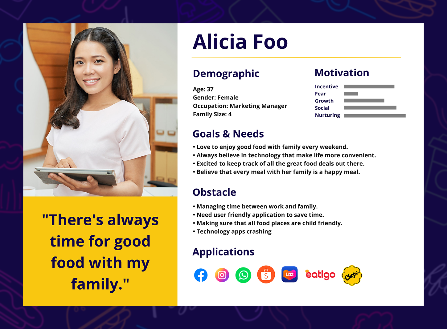
Persona
User Interactions with the App
The persona used the app to find a restaurant that caters to children, checked the available deals, and proceeded to reserve seats for her family of four. After dining, she wanted to leave a review for the restaurant but realized that the current Chope app does not have a review feature.
- New opportunities were identified based on the Customer Journey Map, including the addition of a child-friendly indicator for restaurants and more search filters.
- A review feature should also be added to allow users to share more about their dining experiences.
- Adding a bookmark feature on the Home screen can encourage users to revisit the app and easily access restaurants they have recently explored.
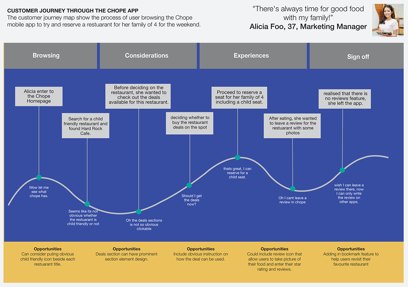
Customer Journey Map
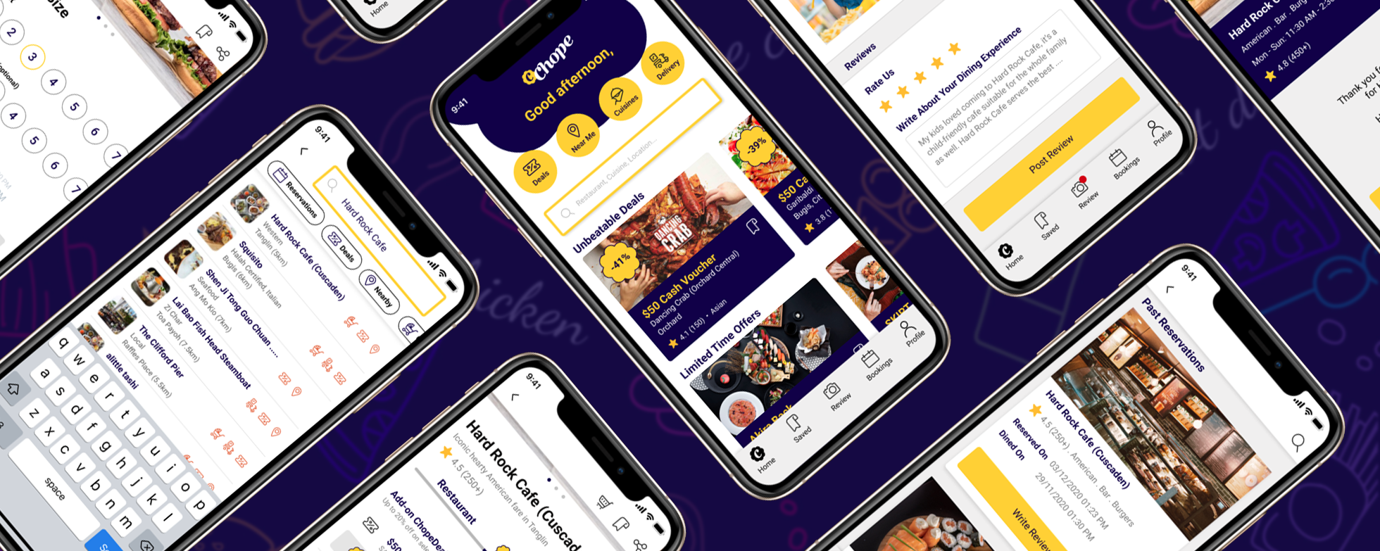
Tackling the Designs
Upon reviewing the screens from the Chope app, several issues were identified and documented based on their respective screens. The purpose of this is to determine whether addressing the listed issues will have the greatest impact through optimization.
Home Screen
Home Screen
Issue 1 — Users feel that visual clutter exists due to inconsistencies in image sizes and layout.
Issue 2 — There is a lack of a bookmark feature, which could encourage users to revisit their favorite restaurants.
Issue 3 — The interface is misleading, making it unclear whether the user is viewing a deal or a restaurant.
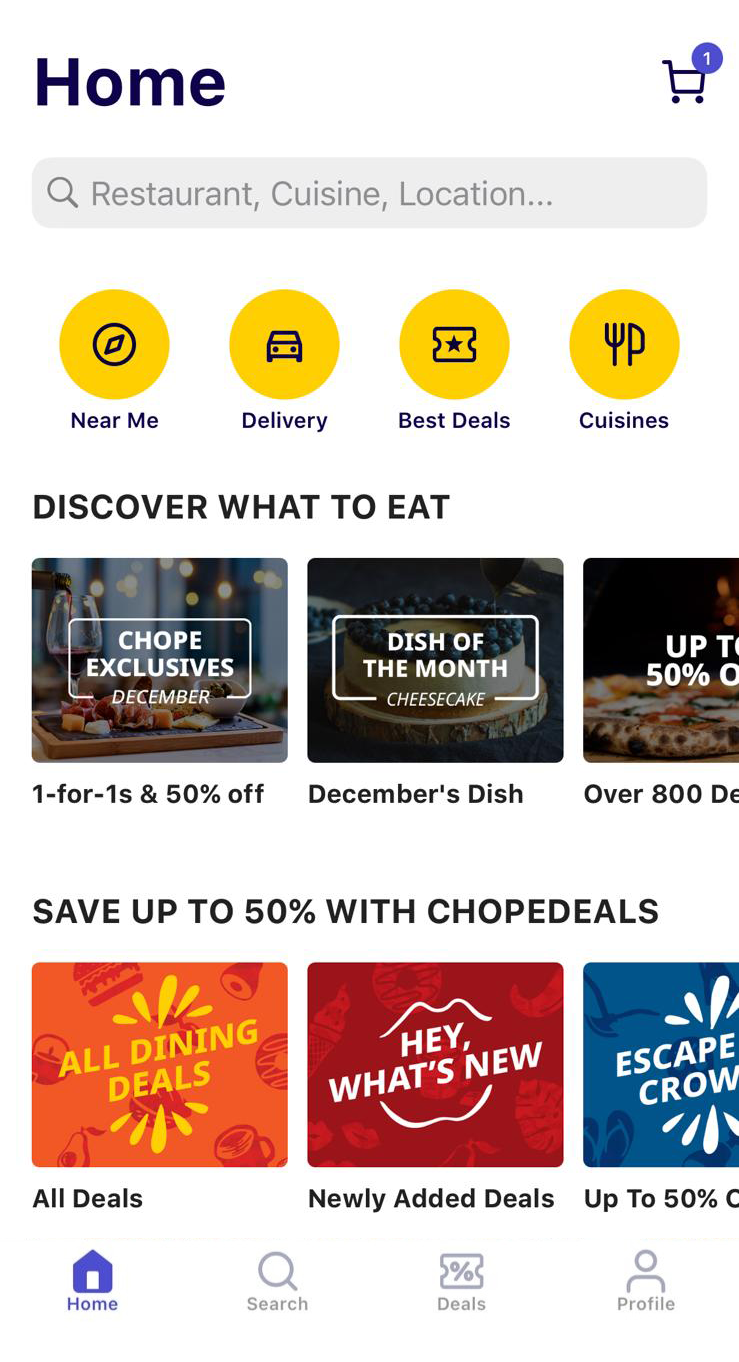
Home Screen
Issue 4 — The search option is duplicated, appearing both at the top and bottom of the screen.
Issue 5 — From the Home screen, it is not clear what services Chope provides.
Search Screen
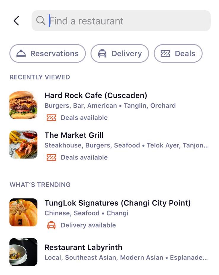
Search Screen
Issue 1 — There is no child-friendly icon beside each restaurant, nor a filter function to identify such options.
Issue 2 — Users also suggested that it would be helpful to have filters to view restaurants that are nearby.
Issue 3 — Lack of more filtering options.
Restaurant Screen
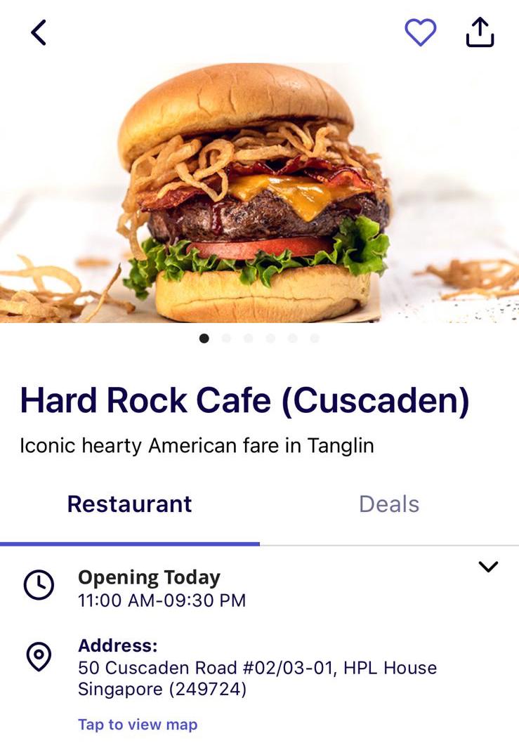
Restaurant Screen
Issue 1 — On the restaurant screen, the deal button is not clearly pressable and is not prominent enough to indicate that deals are available.
Issue 2 — There is a lack of star ratings, which could help users make quicker decisions.
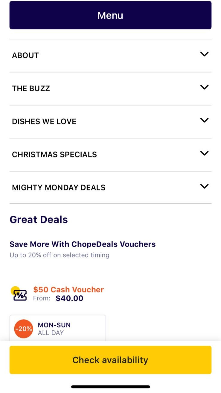
Restaurant Screen
Issue 1 — There is too much information, such as "THE BUZZ" and "DISHES WE LOVE", resulting in excessive scrolling.
Reservation Screen
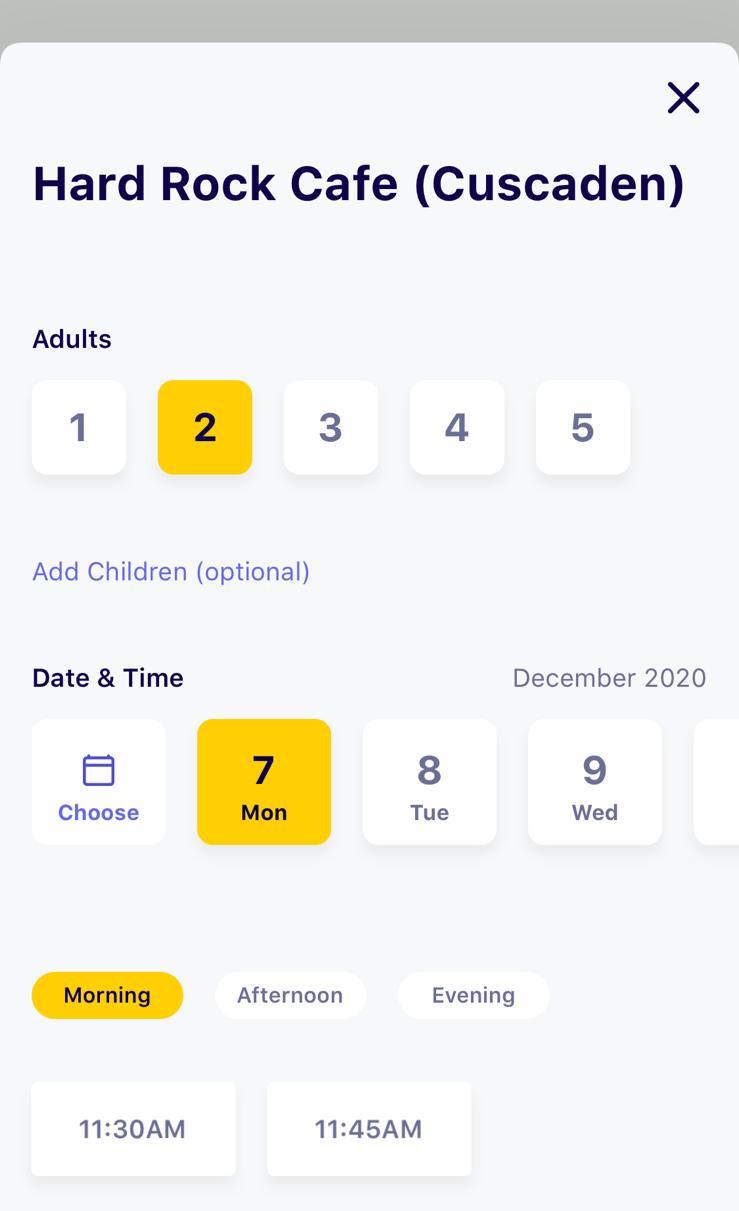
Reservation Screen
Issue 1 — The interface for selecting date and time could be simplified to make the selection process more efficient.
Proceed Screen
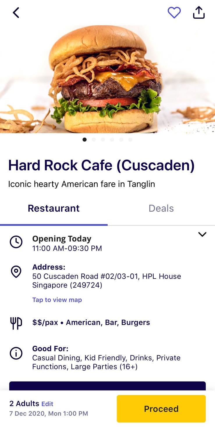
Proceed Screen
Issue 1 — If users change their mind about the restaurant selection, they must press the "Back" button multiple times to return to the Home screen. A button should be added next to the "Proceed" button to allow users to return directly to the Home screen.
Issue 2 — Deal vouchers added to reservations are not visible after selection.
Confirmation Screen
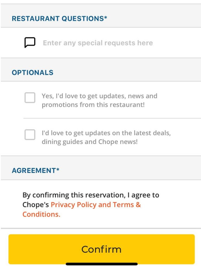
Confirmation Screen
Issue 1 — The label "Restaurant Questions" is misleading. It should be changed to "Any Special Request?" to make it clearer for users.
Issue 2 — A button should be added here to allow users to return directly to the Home screen if they change their minds.
Prioritising the Solutions
The solutions and user feedback were prioritized based on the issues identified earlier. The frequency and complexity of each solution determined the prioritization results.
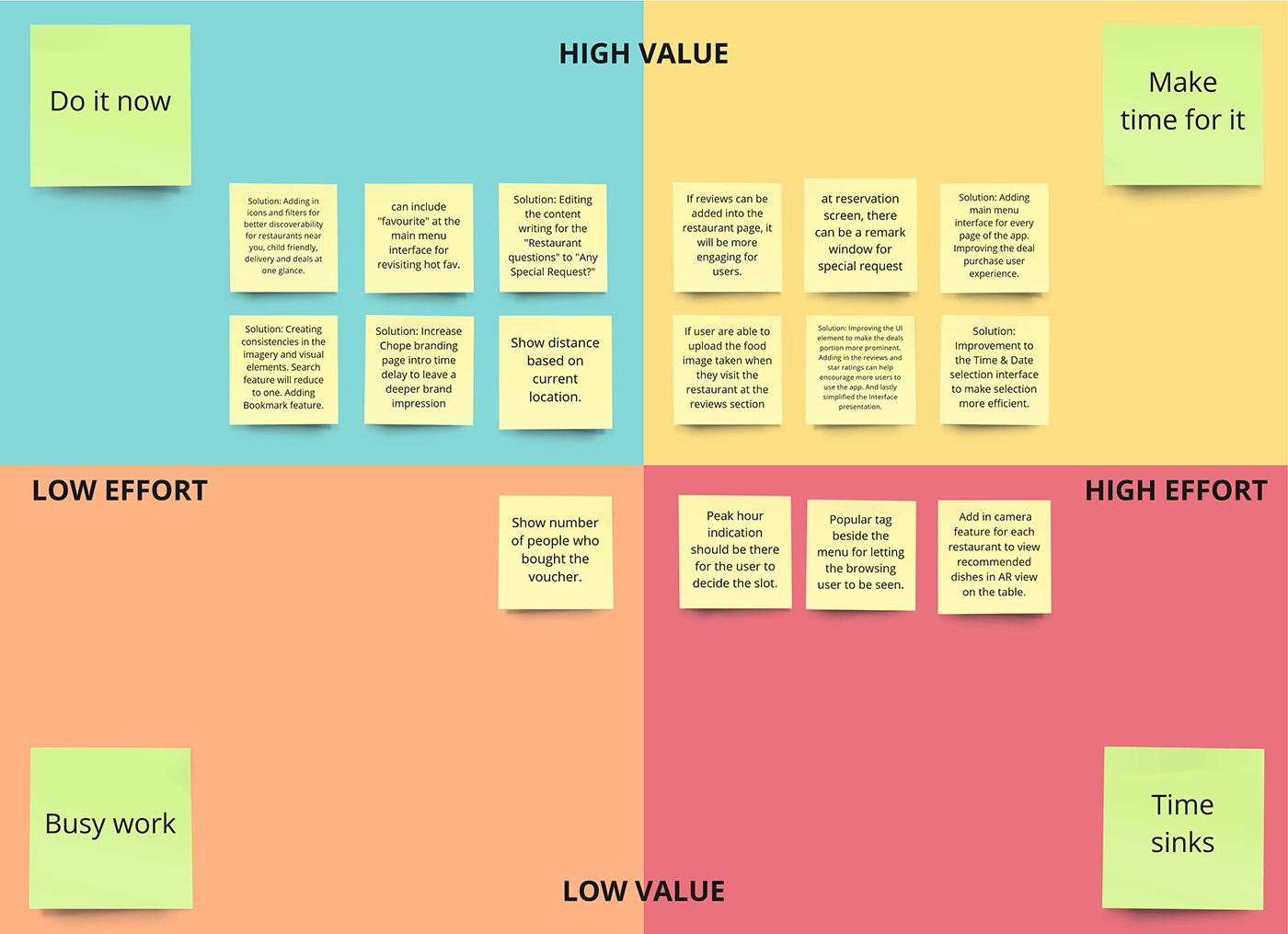
Prioritising the Solutions
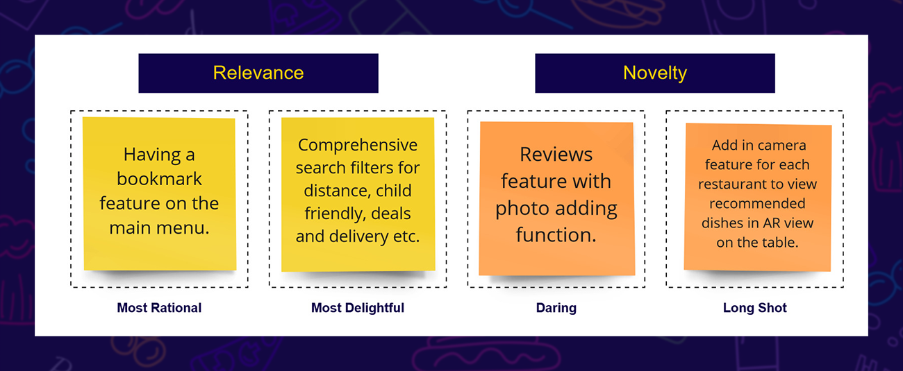
Ideating with Four Parts Categories
After prioritizing, ideas and solutions were ideated and finalized into 4 parts categories based on relevance and novelty. The ideas selected for implementation in the design include a bookmark feature on the menu, comprehensive search filters, and a review feature with photo-uploading functionality.
Four Categories Method
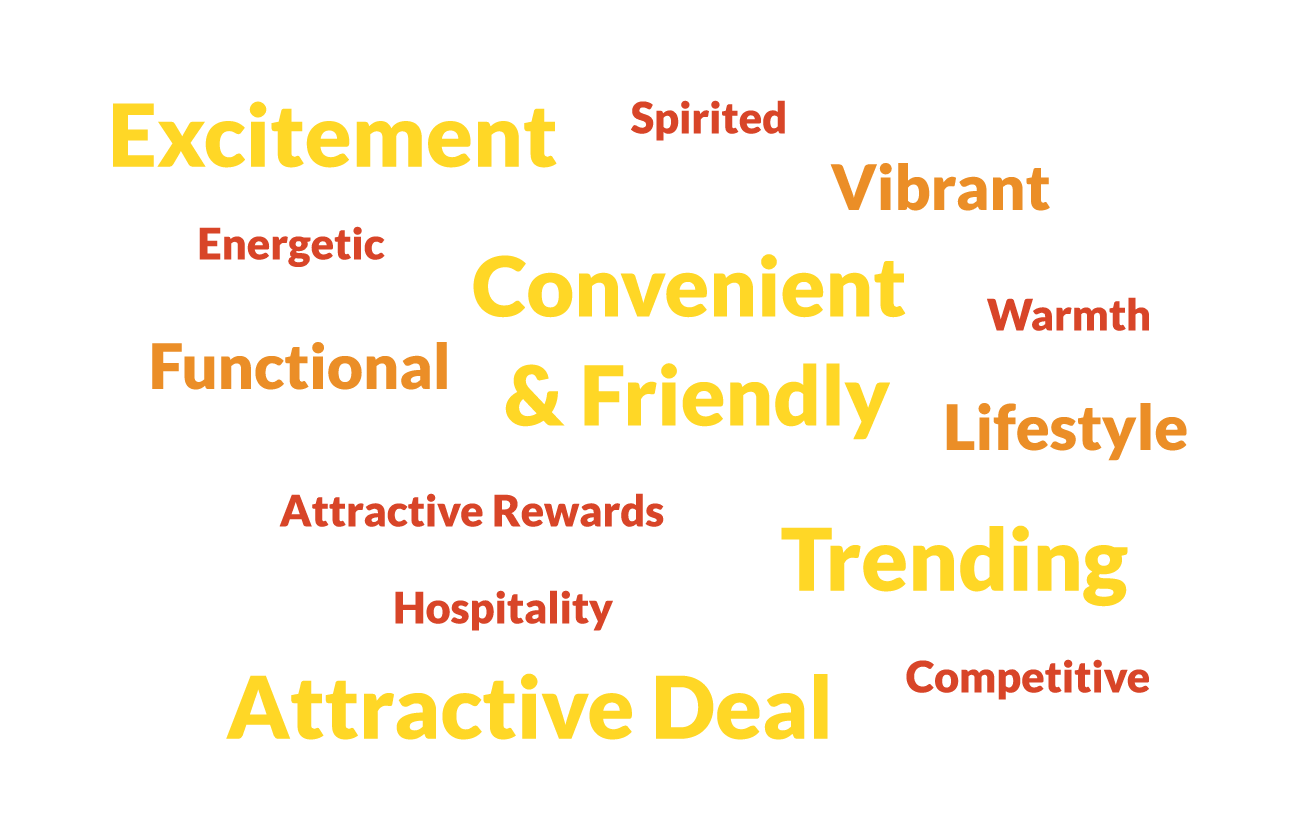
Determining the Brand Style & Personality
Some of the keywords brainstormed to represent the Chope brand include: excitable and vibrant (Excitement), convenient and user-friendly (Convenient & Friendly), always up-to-date (Trending) and offering bonuses and perks (Attractive deals).
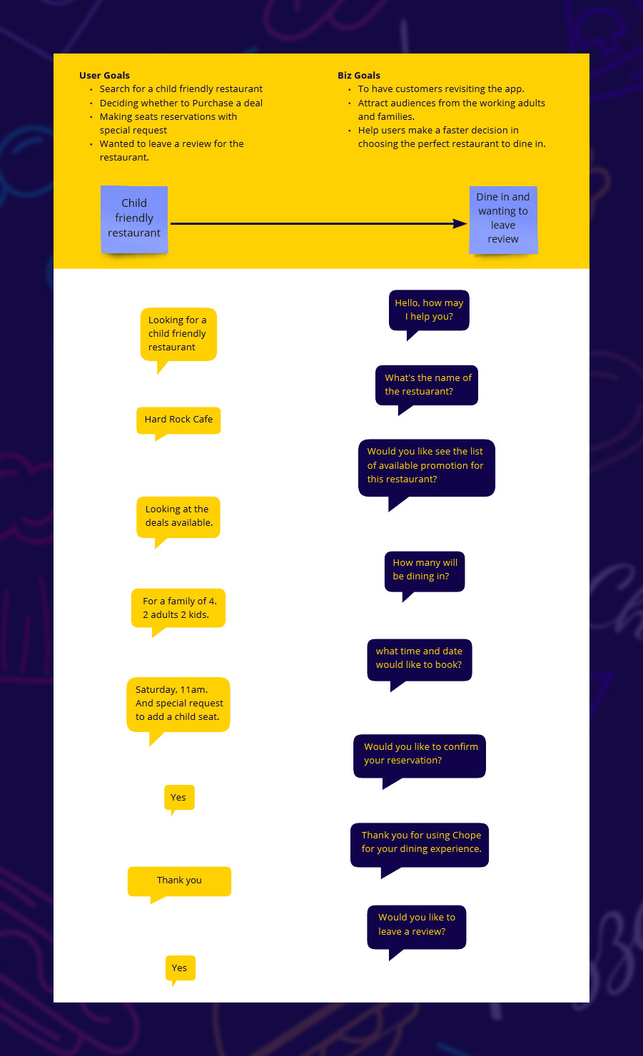
The User Goals and Business Goals via Conversation
The Content-first Exercise was conducted by forming turn-based conversations. First, user goals and business goals were established, along with the flow of what the user aims to achieve. This approach provided valuable guidance in refining the prototypes based on the questions and responses from the conversation in later stages.
Content-first Exercise
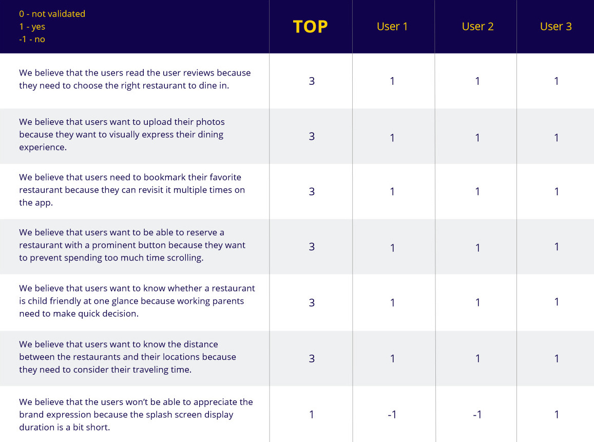
Ranking the Hypotheses
Remote testing was conducted with three users to evaluate the initial designs. A list of hypotheses was created for the user testing, along with specific goals for users to achieve while testing the prototype. The results were then used to iterate and improve the design.
Hypotheses Ranking
Moodboard
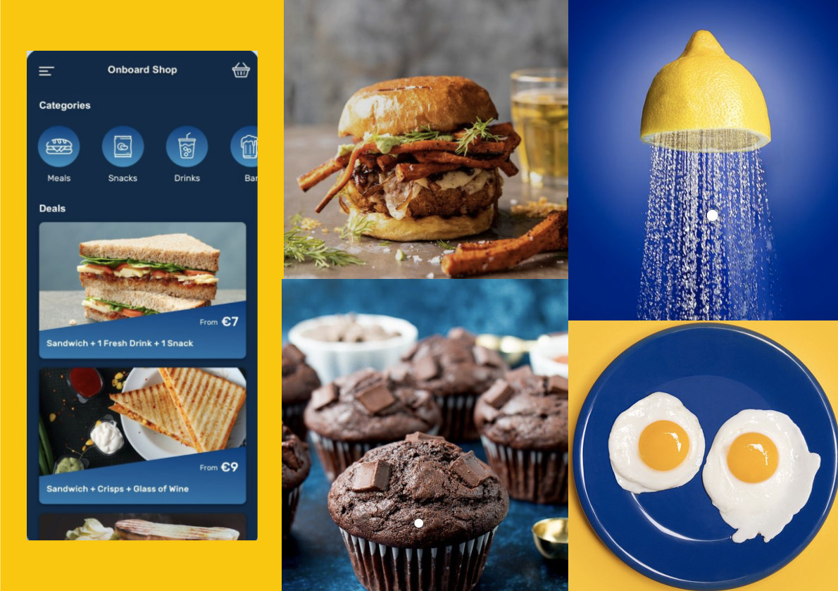
An analysis of the brand colors was conducted and used to enhance the brand personality by creating a vibrant and fun identity. The use of more blue in contrast with Chope's bright yellow branding creates a bold and friendly impression.
Moodboard
Communicating with the Brand
The Brand Style Guide provides a set of standards, principles, and rules that help maintain visual consistency and improve design efficiency. It includes the color palette, fonts, icons, grids, and UI components used in the design.
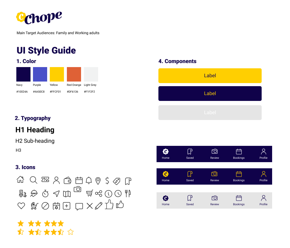
Brand Style Guide
Wireframing
Before creating the prototypes, wireframes were used early in the development process to establish the basic structure of the app and to explore the different screens before visual design and content were added.
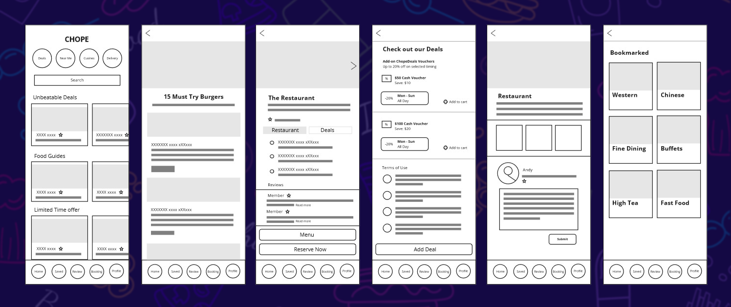
Wireframing
Prototype
Visualising by Hierarchies
After completing the previous stages, the screens were designed to suit the target users. Visual elements were created to maintain consistency throughout the screens. Using hierarchies provided a clear structure, allowing for the prioritization of headers and menus according to user needs and desired actions.
The hierarchy orders are as below
Size — of images and fonts
Color — corporate color theme
Contrast — of color and font style
Alignment — of components
Repetition — objects to be on the same placement. CTA button for example.
Proximity — spacing between each of the components.
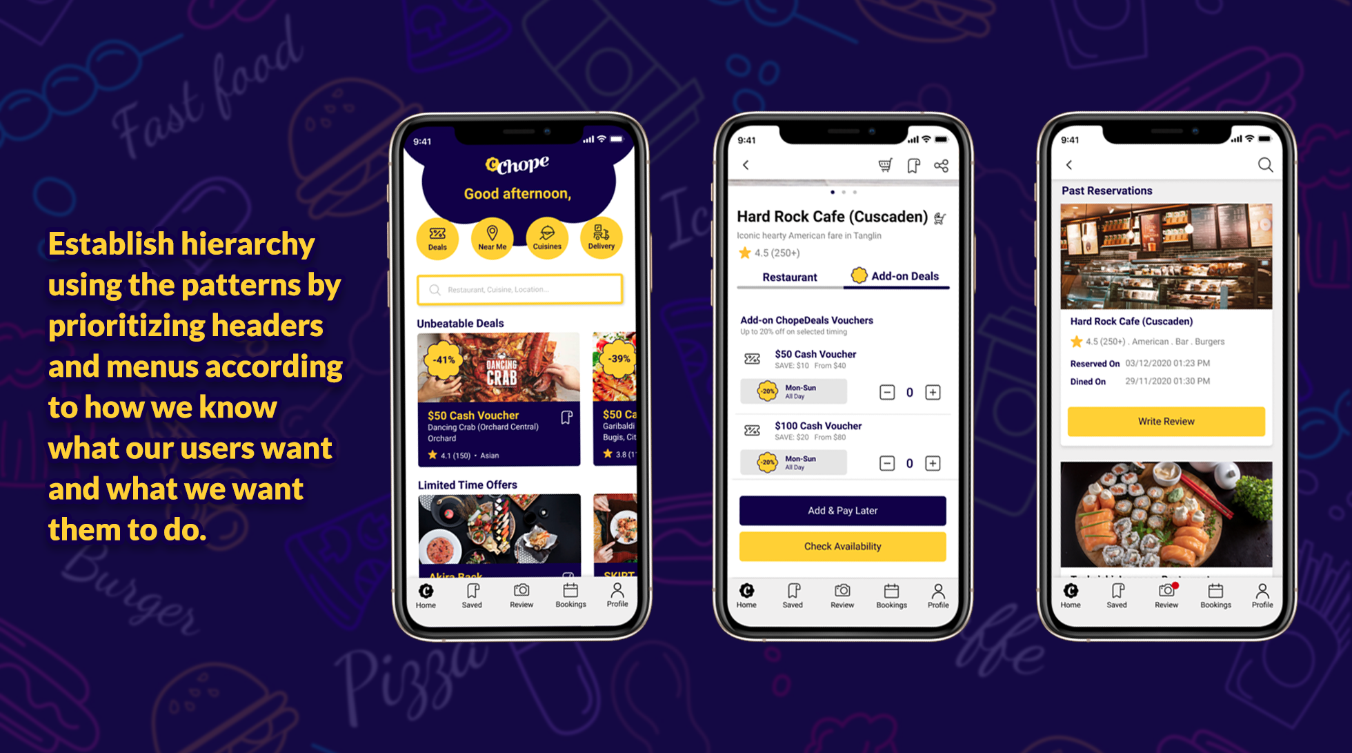
Visualising by Hierarchies
Components Usage and Placement
Match Between System And Real World
- Using the real world standard of tools that everyone is familiar with.
Visibility of System Status
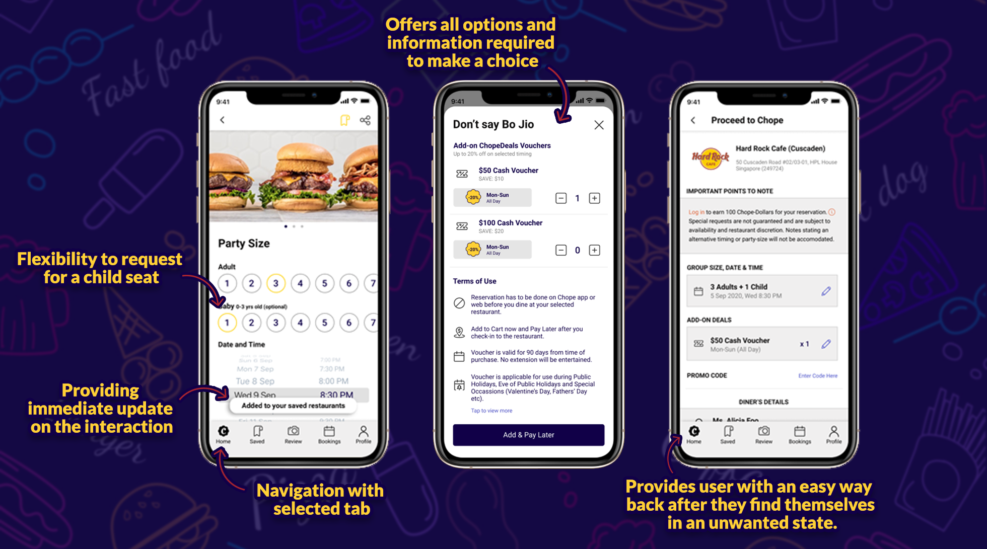
- Providing users with information about the system status and feedback after every interaction.
Flexibility And Efficiency of Use
- Giving users the flexibility of PayLater option, in case of unforeseen reasons.
- Flexibility and easy to use option to request for child seat.
Recognition Rather than Recall
- Help users not missed out great deals, by giving them a reminder or a shout out.
User Control and Freedom
- Providing users with an easy way back after they find themselves in an unwanted state.
Components Usage and Placement
The Final Walkthrough
The walkthrough covers the steps from the persona's journey map. It demonstrates the booking process for a child-friendly restaurant, including the review feature and the bookmark feature using the search function. Users can not only leave reviews but also view reviews from others across different types of restaurants.
The Retrospective
During the retrospective stage, goals were identified, along with factors that slowed progress, elements and participants that contributed positively, and risks encountered. These insights were combined into the Sailboat Exercise to help achieve the objectives.
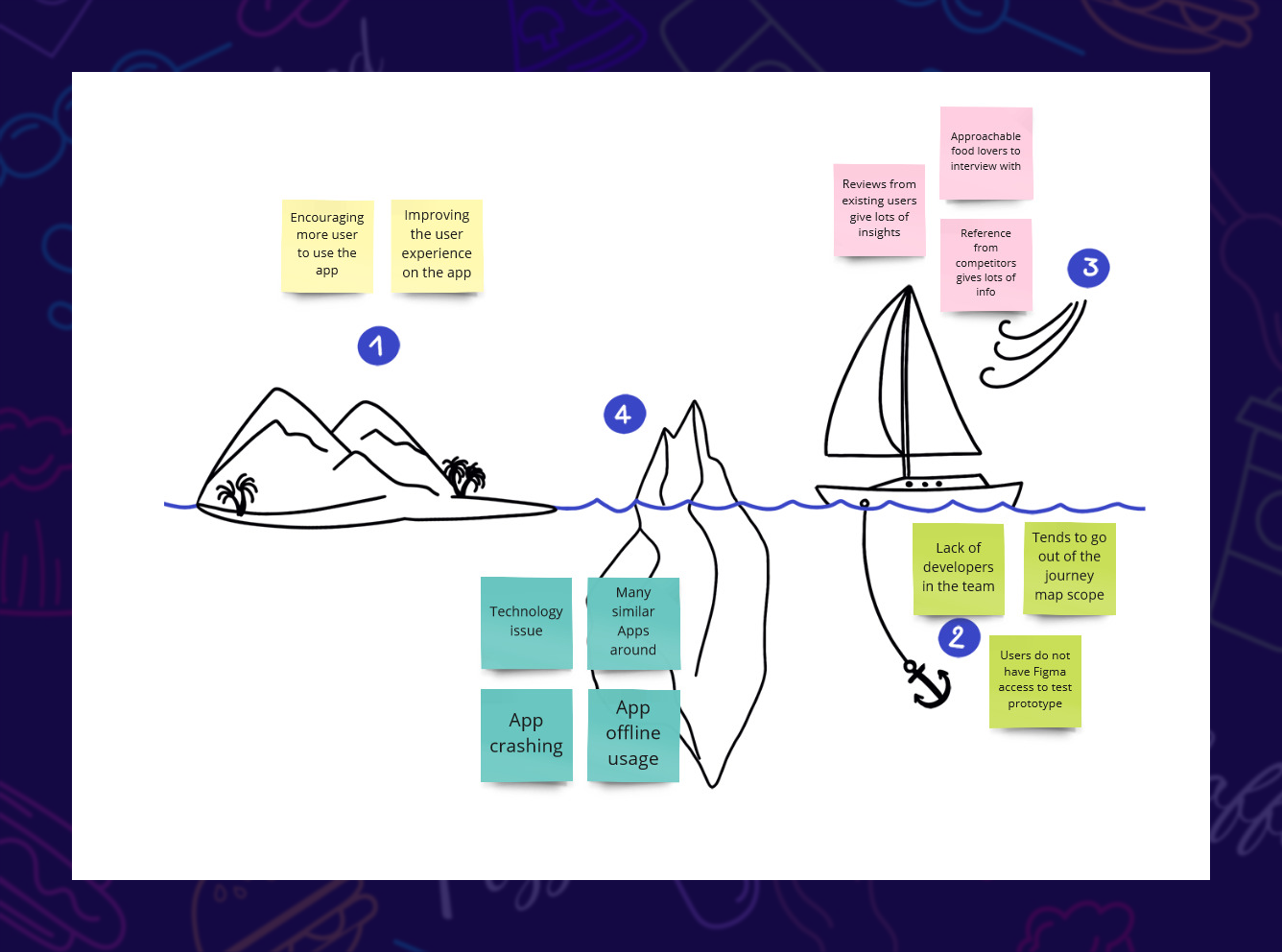
Sailboat Exercise
In conclusion, improvements were observed in visual clutter, consistency, search filtering, user feedback, and overall simplicity of the app.