I leaned my cheek against the coolness of the window pane and closed my eyes, listening intently to the sound of people passing by.
How much longer will it be necessary to stay indoors?
Books have always had the ability to transport readers to different worlds, allowing them to escape their immediate circumstances. However, with the emergence of the COVID-19 pandemic, public libraries were forced to close, and physical books became potential vectors for the virus.
The Challenge of the Project
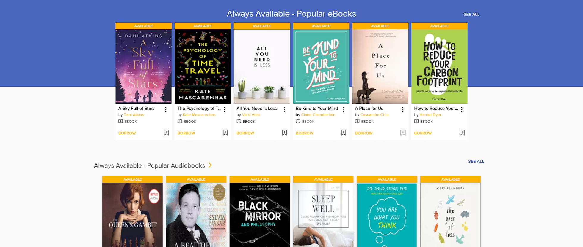
The goal of the project was to conduct in-depth user research and identify opportunities to enhance the user experience on NLB's OverDrive website, ensuring that users can continue to access the literary world through eBooks, providing a source of respite during these challenging times. NLB OverDrive is an online portal that allows users to borrow eBooks and audiobooks in partnership with OverDrive.
The Research Process
The first step of the design process involved conducting user interviews to uncover habits, behaviors, motivations, and frustrations.
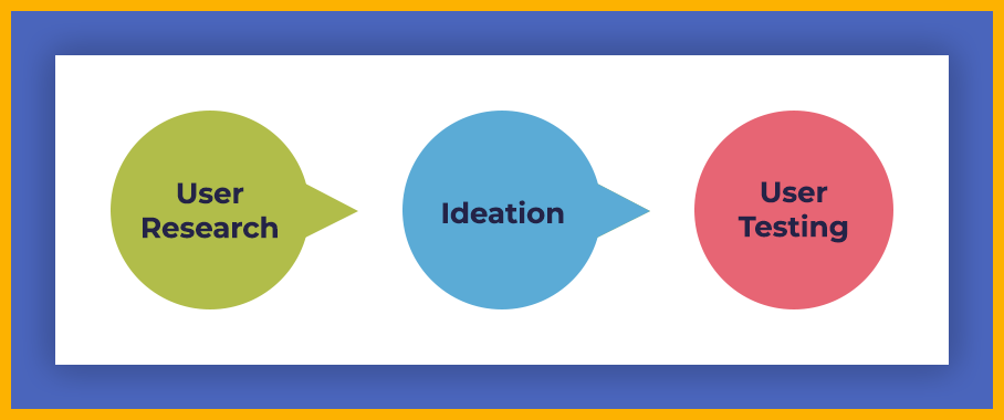
The Research Process
Observing the Users
The process began with interviewing and observing seven users remotely, guided by Jakob Nielsen's article in Why You Only Need to Test with 5 Users which suggests that the first three to five participants can reveal approximately 75-99% of usability issues.
Interviewing the Audiences
The interview sample focused on young working adults aged 24 to 30 with varying reading habits. Attention was given to the diversity within this group by intentionally including participants of different races, genders, and backgrounds. Notably, one participant was color-blind and provided valuable insight by allowing the interface to be viewed from a distinctly different visual perspective.
With clear objectives in place, an interview guide was developed. Each session lasted approximately 30 minutes and covered topics designed to uncover user habits, motivations, and pain points. Participants were asked questions such as:
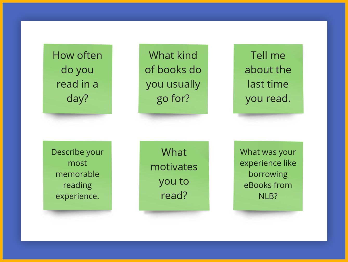
Some Interview Questions
Interview Findings
- Many readers either browse online for recommendations, look for titles by the same author as their most recent read, or visit bookstores for bestseller suggestions before heading to NLB.
- Book readers often feel a sense of accomplishment when they purchase books and a sense of empowerment after finishing them.
As part of the research, the aim was to understand the typical journey a reader takes before entering a bookstore. Each individual mapped out their own flow, which was then consolidated into a single overview shown below.
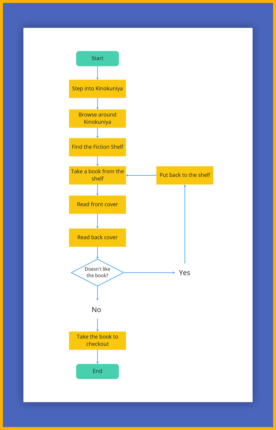
Book Reader Flow in a Book Shop
Immersed Ourselves as Users
To better understand users' experiences, the team went through the full process of searching, borrowing, and returning eBooks on the NLB Overdrive website. Experiencing the site firsthand made it easier to relate to the feedback shared by users as they navigated their own journeys.
As information from participants and firsthand experiences came together, attention was given to what users saw, thought, did, and felt. These insights were then organised into an empathy map for easy reference.
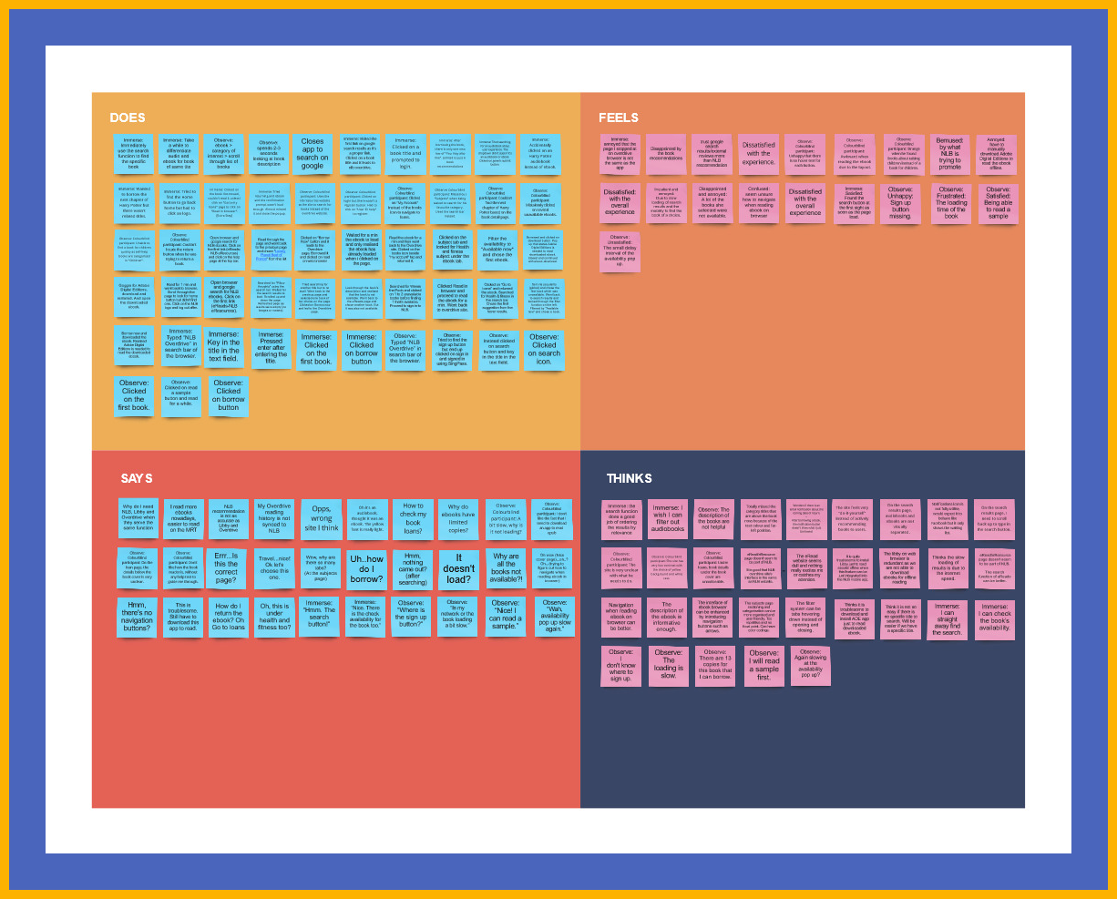
Empathy Map
Synthesising User Research
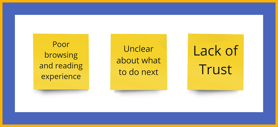
Based on inputs from participants in the user research, data points were analyzed using an Affinity Map to identify similarities and patterns in user behavior. By ranking these broader categories according to the number of observations within each, three clear priorities emerged:
Synthesising User Research
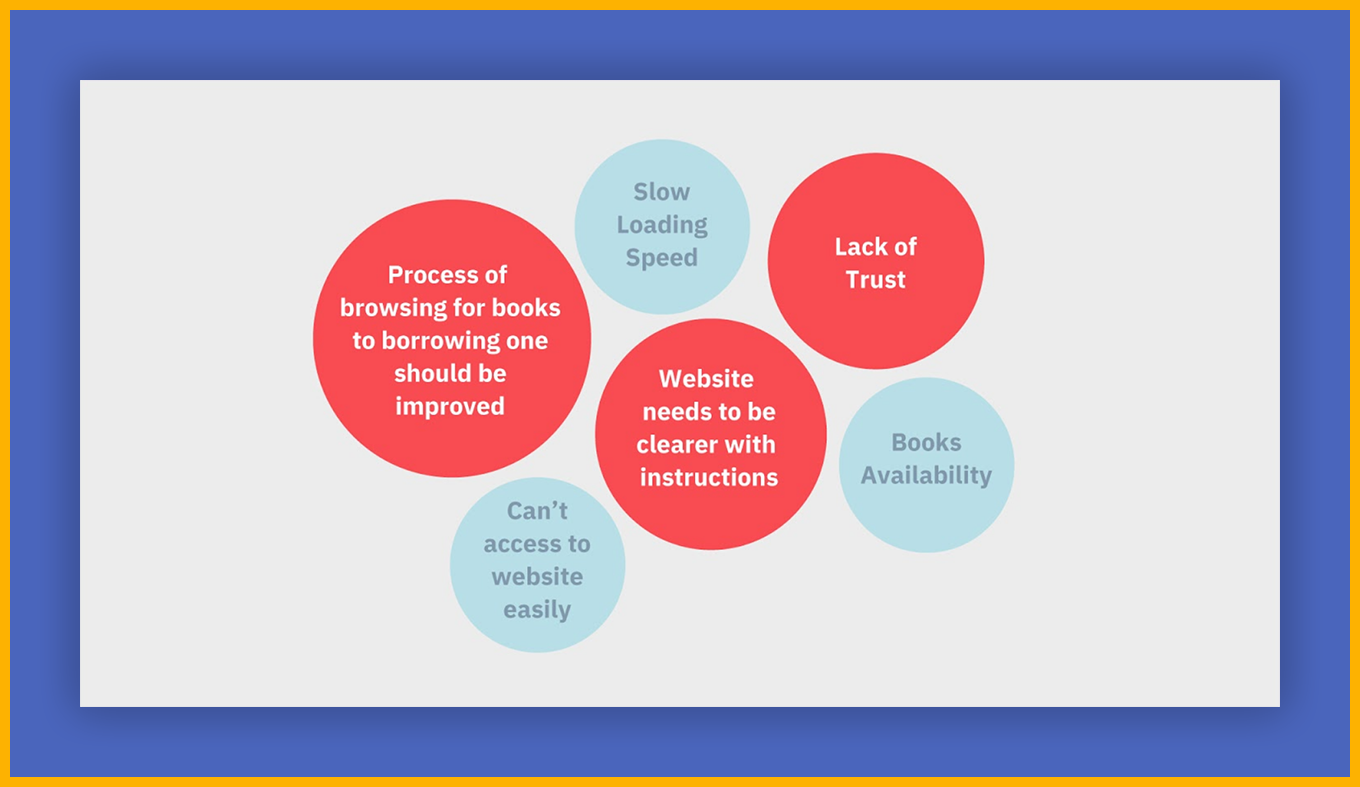
Defining the Priorities
Once the three priorities were identified as the foundation for the redesign, the associated pain points and user needs were compiled as follows:
Pain Points
- Most participants reported confusion when navigating the site to search for suitable books.
- Before borrowing, they relied on reading the sample since the page description was not very helpful.
- Many eBooks were unavailable for download, which frustrated most participants.
- Most participants were disappointed with the reading experience, describing it as unengaging.
Needs
- Better book recommendations — This would allow users to spend less time searching and more time reading new books.
- Control over a personalized feed — Instead of presenting the same standard list to every user, participants preferred the ability to show or hide categories according to their interests.
Populating the Persona
These data points, analyzed and identified from previous stages, informed the pain points and needs, providing a foundation for crafting the persona.
Persona Data Points
Once all the information was compiled, a persona was developed and named Sarah Lee. Sarah was created based on a sample of respondents. While she does not represent every user, as many issues were highlighted by diverse individuals, she serves as a focal point for the design process.
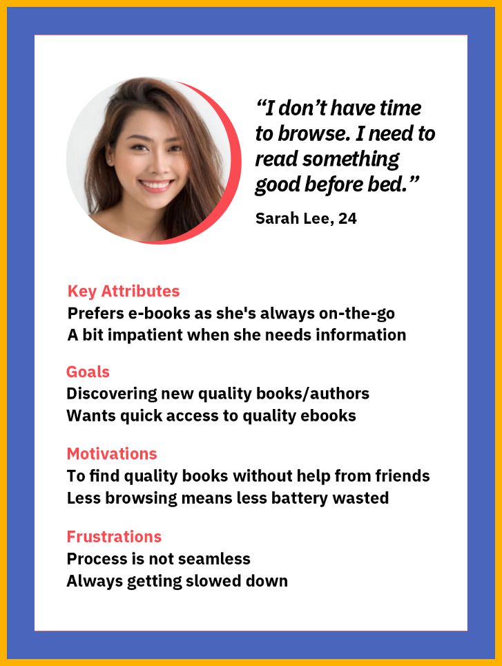
Persona
Mapping Out the Customer Journey
To focus on Sarah's experience in a single scenario, her journey was mapped from the moment she enters the website to the point where she decides whether or not to borrow a book of interest.
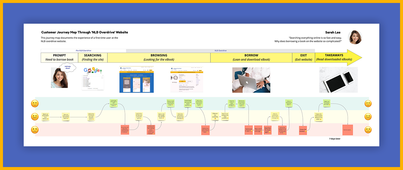
Customer Journey Map
Brainstorming the HMW Statements
Whenever the journey dipped into the red zone, it highlighted an opportunity for intervention.
How might we address these dips?
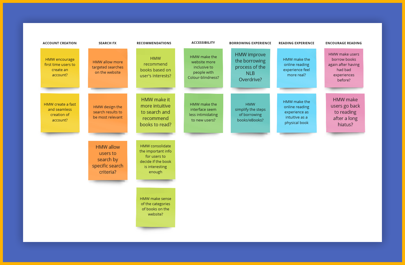
Brainstorming the HMW Statements
The team then voted on the most compelling and significant core question to address collaboratively.
How might we recommend books based on user's interests?
Using two primary brainstorming techniques, a range of ideas was developed to potentially address the core question described above.
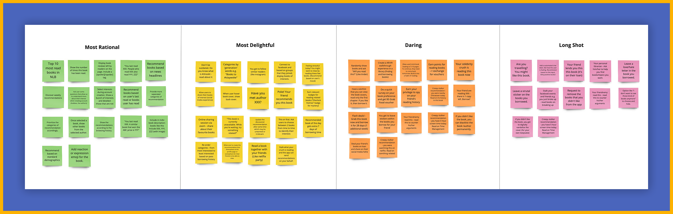
Brainstorming Technique: Four Categories Method
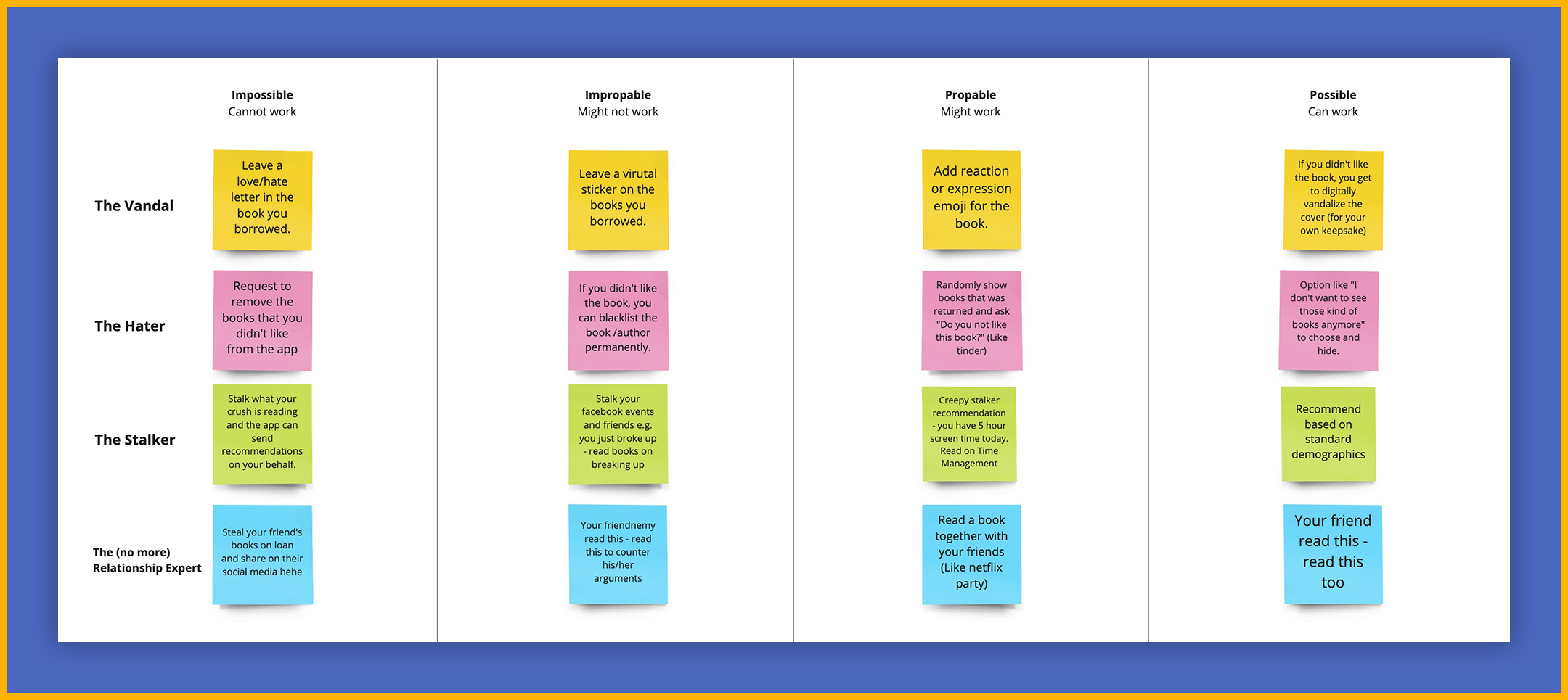
Brainstorming Technique: Impossible to Possible
Features We Wanted to Prototype
The brainstorming process was energizing, with the team generating a wide variety of ideas, some more unconventional than others. From these, three key features were selected for prototyping:
Getting to know the user from the start
Sarah's frustration appeared to stem from the unsuitability of the books offered, creating friction between her and the goal of quickly accessing quality eBooks online.
This issue could be avoided if users were able to indicate their preferences from the start by selecting their preferred book genres. Book offerings could then be customized to match these interests. A homepage that recommends books tailored to individual tastes would create a strong and positive first impression with every visit.
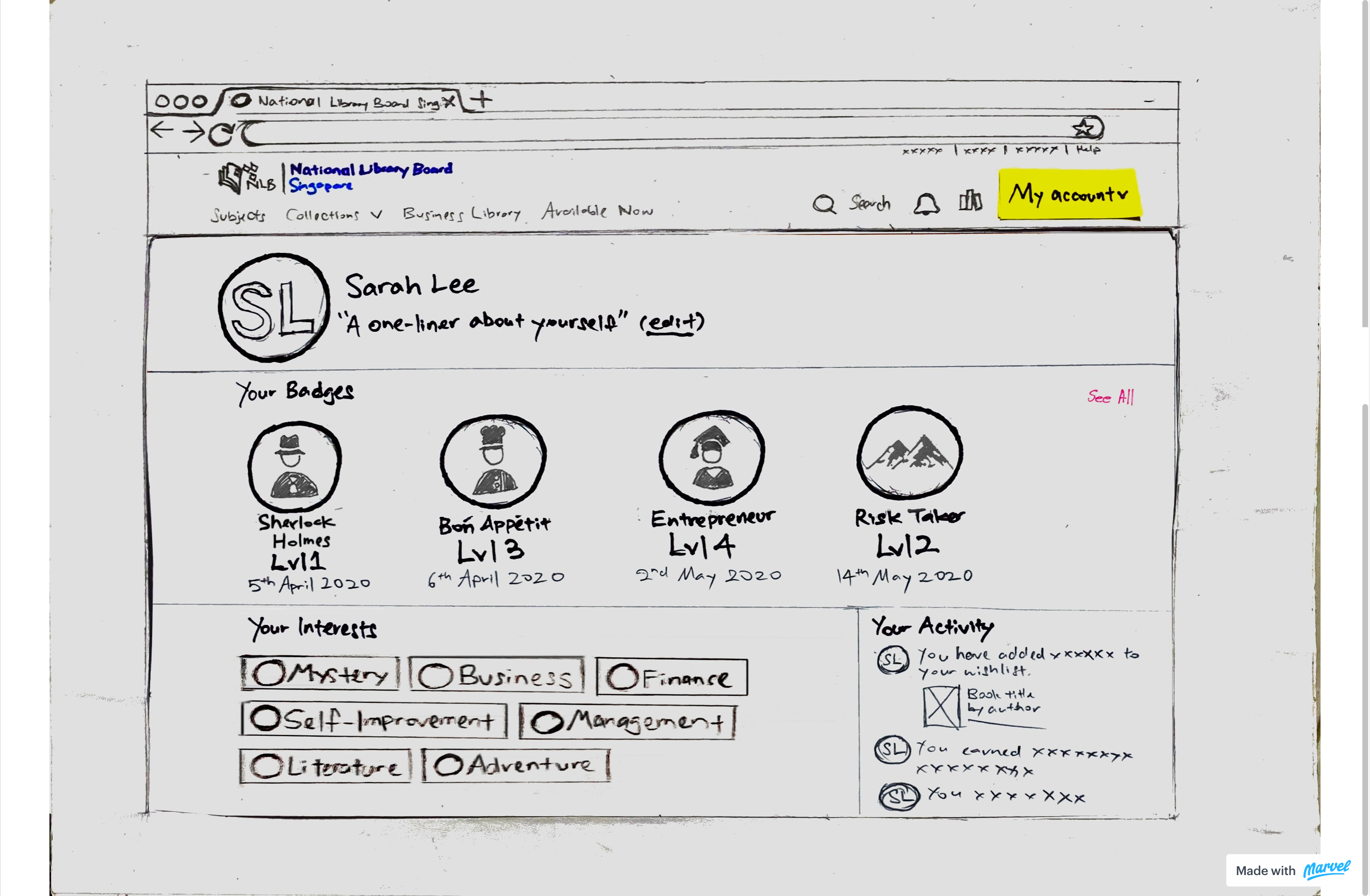
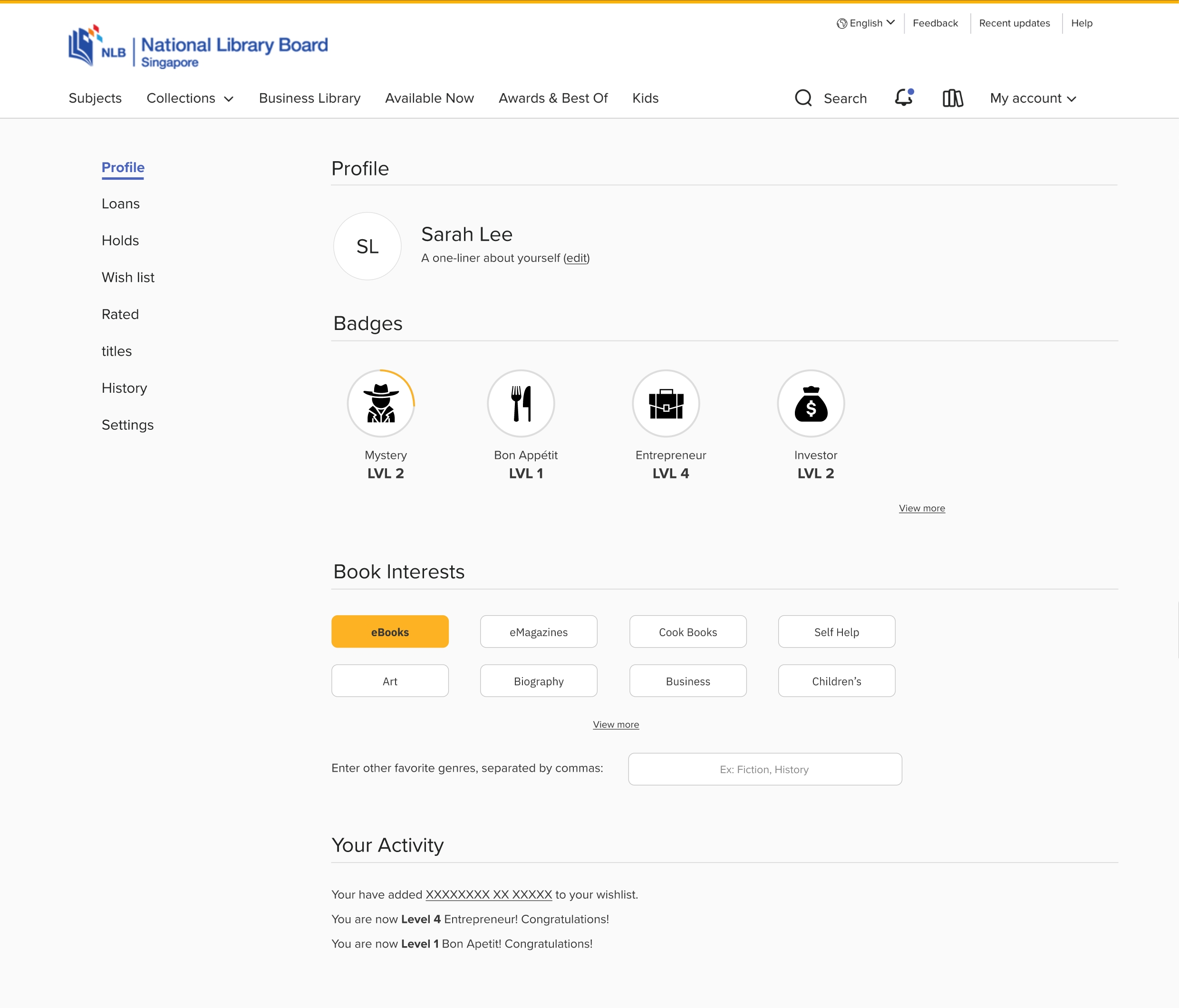
Making the experience fun through gamification
The UX research revealed that not all user experience issues stem from the UI. Unfortunately, there was limited opportunity to address these issues beyond the UI redesign.
The question then became whether it was possible to keep users engaged even with some existing friction. User interviews revealed that book readers often feel a sense of achievement upon finishing a book.
By incorporating a similar motivational element into the NLB website, users could earn badges based on the number and types of books read. This not only fosters a sense of satisfaction but also encourages ongoing engagement and progression, as badges can have different levels.
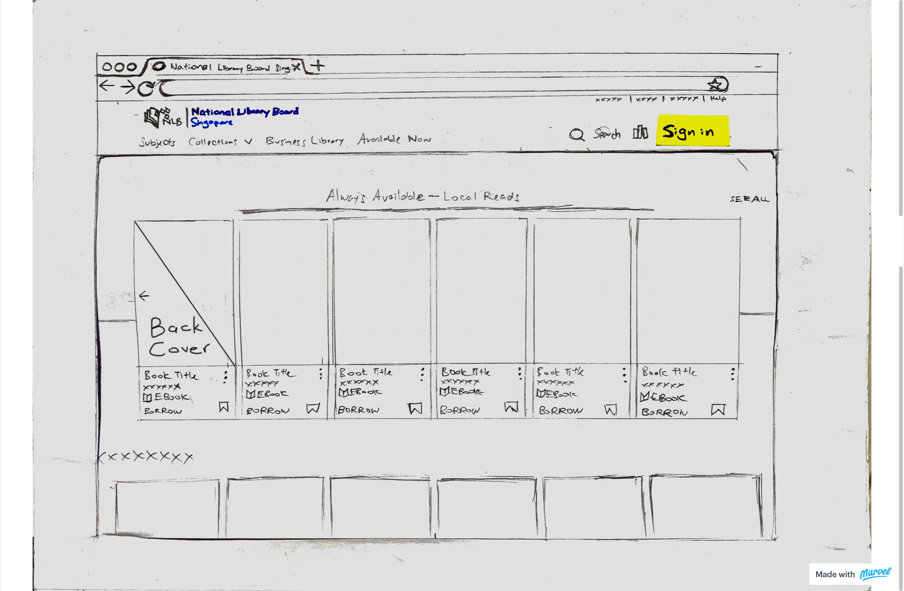
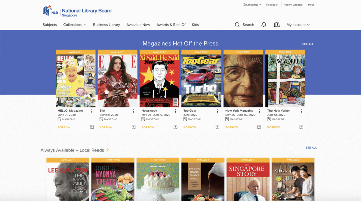
Back cover preview
For Sarah, who is constantly on the go, moves quickly between tasks, and may be somewhat impatient, there may not be time to click through multiple books to read the details. She might, however, be more inclined to swipe to quickly view a book's back cover. Swiping has been recognized as one of the easiest and even subconscious gestures, which App Partner contributor Richard Pallardy credits for Tinder's success.
Moreover, the "Back Cover" concept of a physical book is familiar to most users, as illustrated in the book reader journey map below from the user research, and can be seamlessly adapted into the digital eBook experience.
Drawing the User Flow
After brainstorming relevant and novel ideas, the concepts were translated into specific functionalities, starting with a user flow diagram. This helped provide a clearer understanding of how Sarah would interact with the website to accomplish her goals.
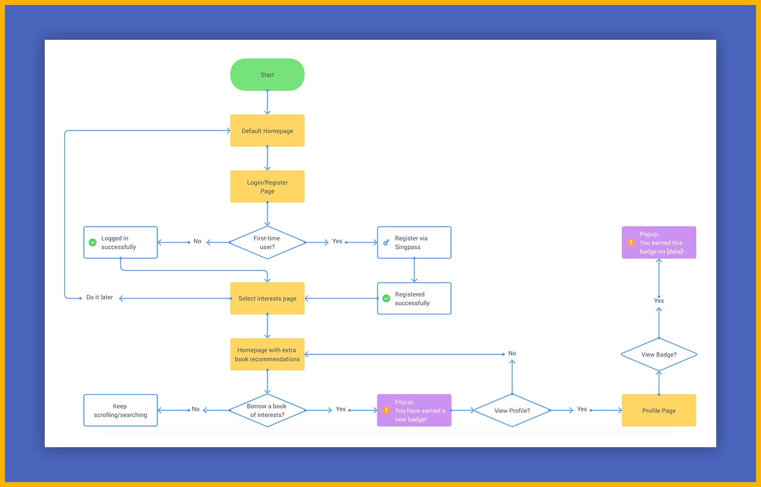
User Flow of Sarah's Interactions
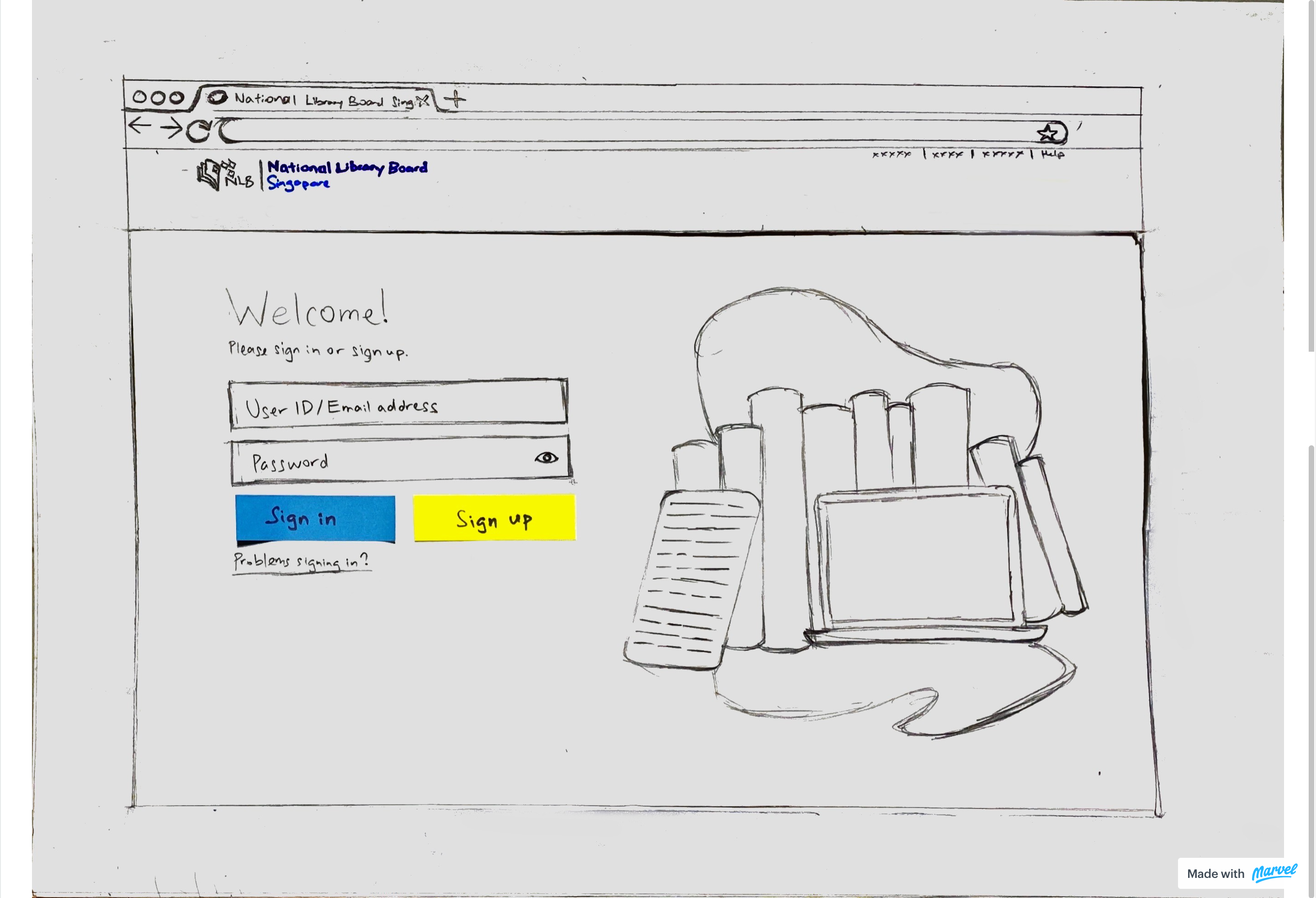
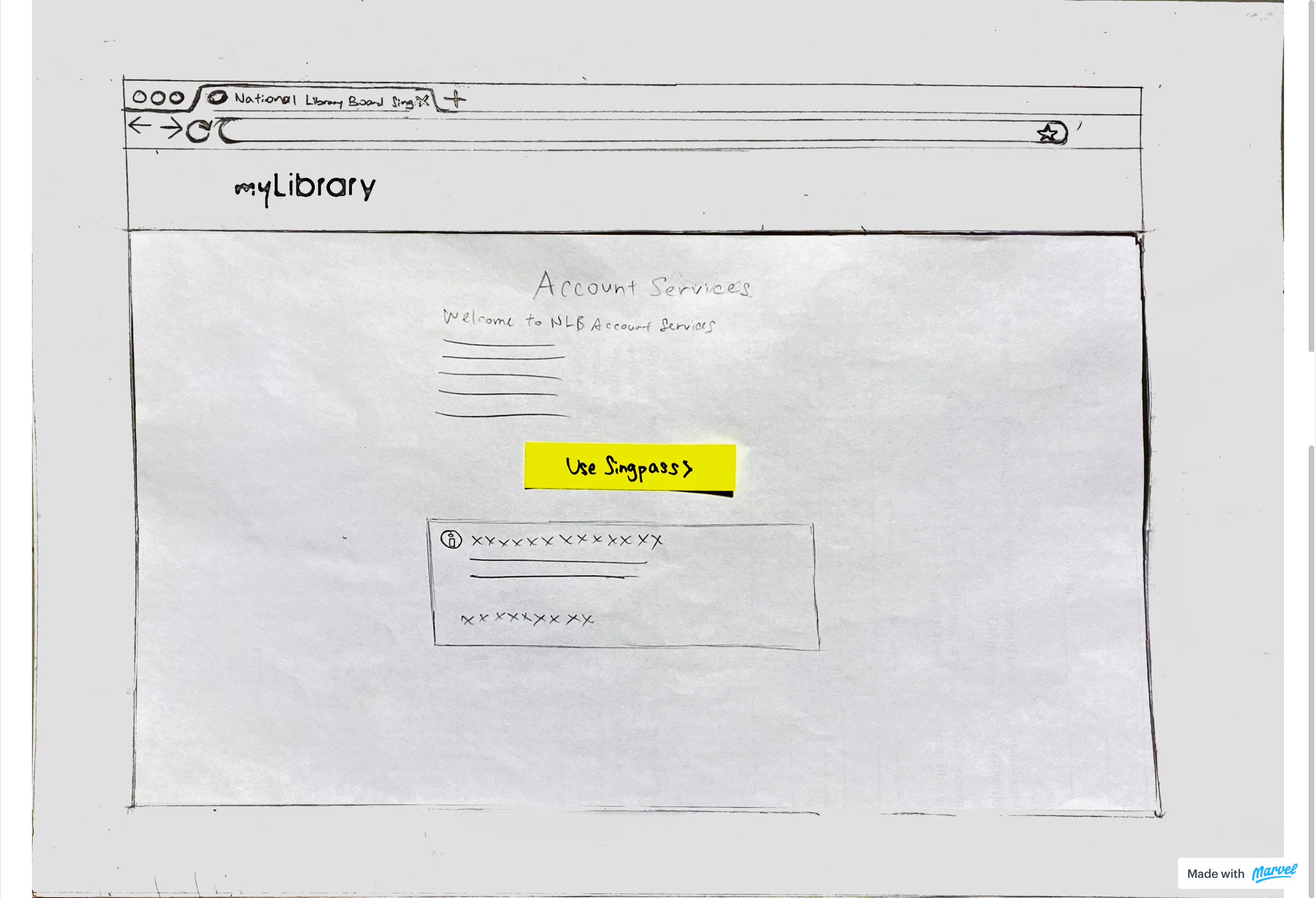
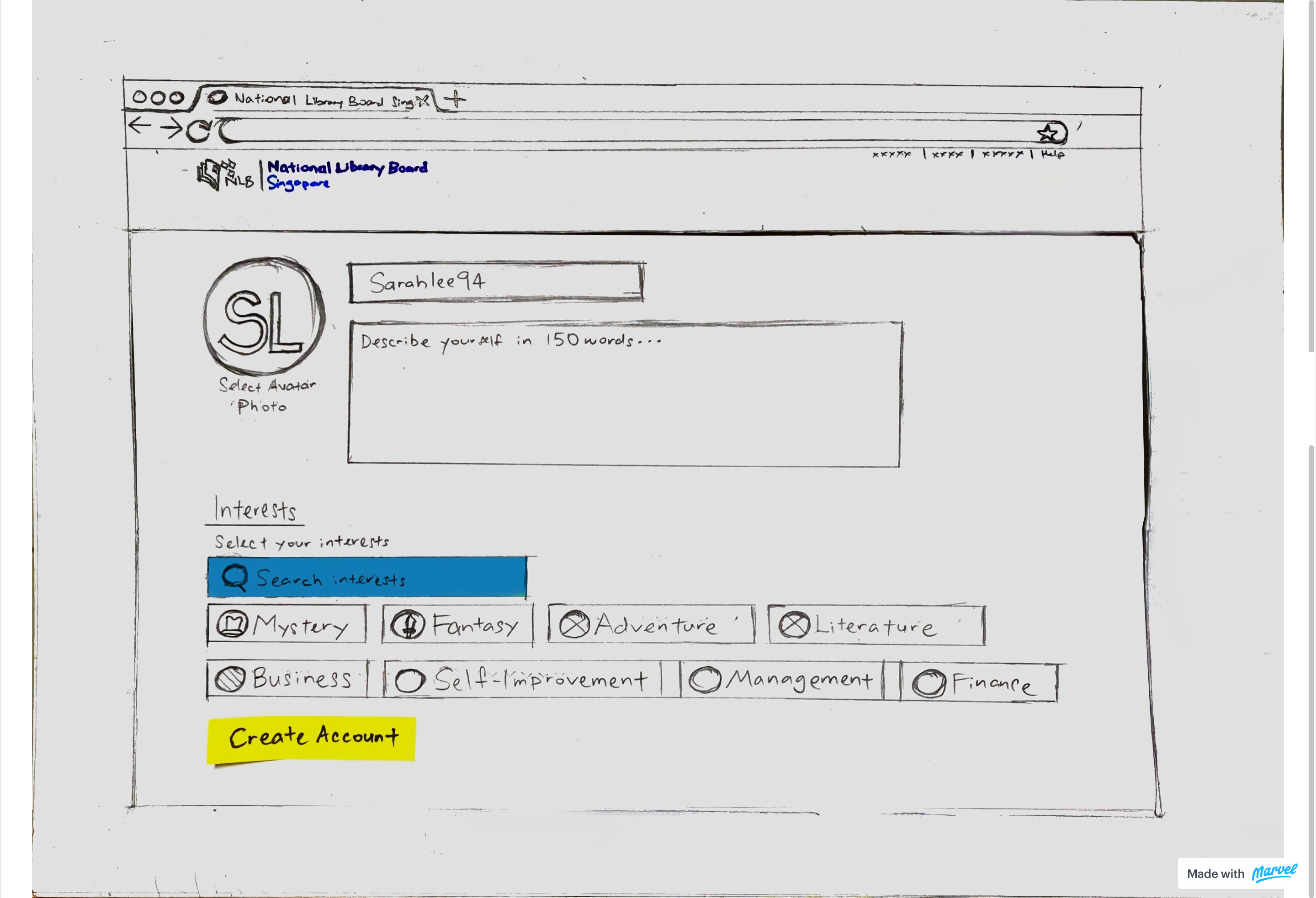
Crafting the Paper Prototypes
To better visualize the user flow, the solutions were sketched on paper. The team then exchanged views and opinions on the flow, as gathering diverse input helps refine and improve the product.
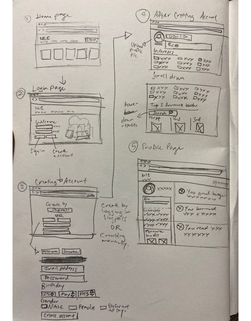
Screen Flow
Feature Ideas
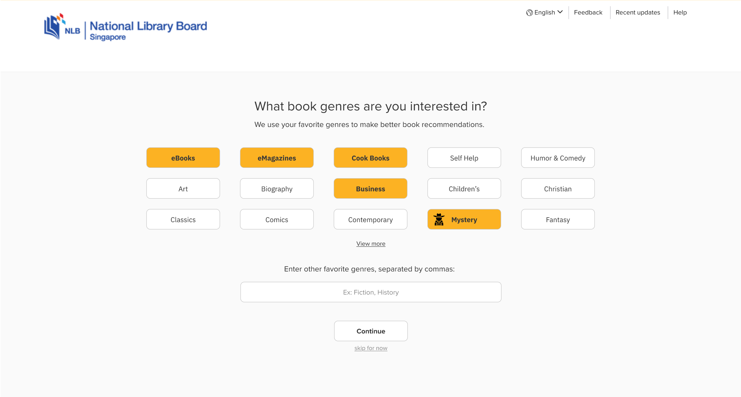
Based on the previously designed user flow, MarvelApp was used to make the wireframes dynamic and clickable, enabling evaluation of how users interact with the proposed screens and early identification of potential errors and points of frustration. Next, mid-fidelity screens were created in Adobe XD, informed by user findings and the paper prototypes developed earlier.
Select Interests
Users can select their preferred book genres, and the homepage will recommend books tailored to those interests.