Raising children as a single parent is challenging under any circumstances, and the difficulty increases for those who are uneducated. They must manage parental responsibilities while balancing housework, employment, and childcare. To overcome these challenges, they need to develop proficiency in their work and acquire new skill sets that enable them to live independently.
Similarly, elderly individuals often become frail and experience declining health. As they age, it is important for them to stay physically and socially active while maintaining connections with the community and loved ones. Support is needed through improved healthcare, nursing services, community programs, and a comfortable living environment.
Reflection is to show that we are able to evolve for better.
About Social Health Growth
Alson Boo, the founder of Social Health Growth (SHG) conducted extensive research on Singapore's independent and volunteer social and economic support systems. His findings revealed a significant number of unwed and single mothers, as well as elderly individuals in the community, who were largely left to face daily challenges on their own. Drawing on his volunteer experience with the Lions Club, he decided to establish a not-for-profit organisation focused on supporting unwed and single mothers and their children.
All beneficiaries developed because of all the motivation and value support which gives them happiness for a lifetime.
The Case Study Brief
The purpose of this case study report is to highlight the design challenges faced by a nonprofit charity organisation in Singapore. The first 3 elements of the 5 elements of UX have been applied, with the remaining two elements to follow. Lean UX hypothesis techniques were used to identify design problems and issues.
The Strategy Plane
Product Objectives
Every day, SHG beneficiaries strive to develop new skills and educate their children while managing daily challenges such as work, housework, and childcare. SHG empowers them to achieve their goals through the effort, time, and funds raised from donations. The organisation aims to support parents and disadvantaged families in raising children to become healthy and contributing members of society, while also providing healthcare for the elderly.
Business Model Canvas
The Business Model Canvas was created to facilitate visualisation of the business model. It is used to modify the existing business model and identify new ones. The canvas has been filled with insights about the organisation, its value propositions, the channels used, and how the organisation operates. It helps in understanding both the organisation's own business model and those of its competitors.
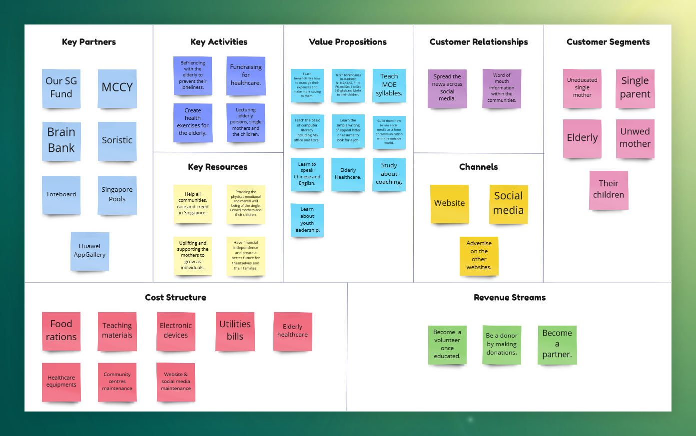
Business Model Canvas
Then the Business Assumptions Exercise was completed. Assumptions were developed regarding user needs, expected benefits, business operations, primary competitors, and potential product risks. The greatest risk identified is enabling elderly or uneducated single parents who are unfamiliar with technology to interact with the product.
User Needs
A persona named Felicia Lim was developed to address the identified problems. Following this, assumptions were formed and a survey was conducted to validate them. The persona outlines her goals, tasks, and the opportunities or features needed to alleviate her frustrations.
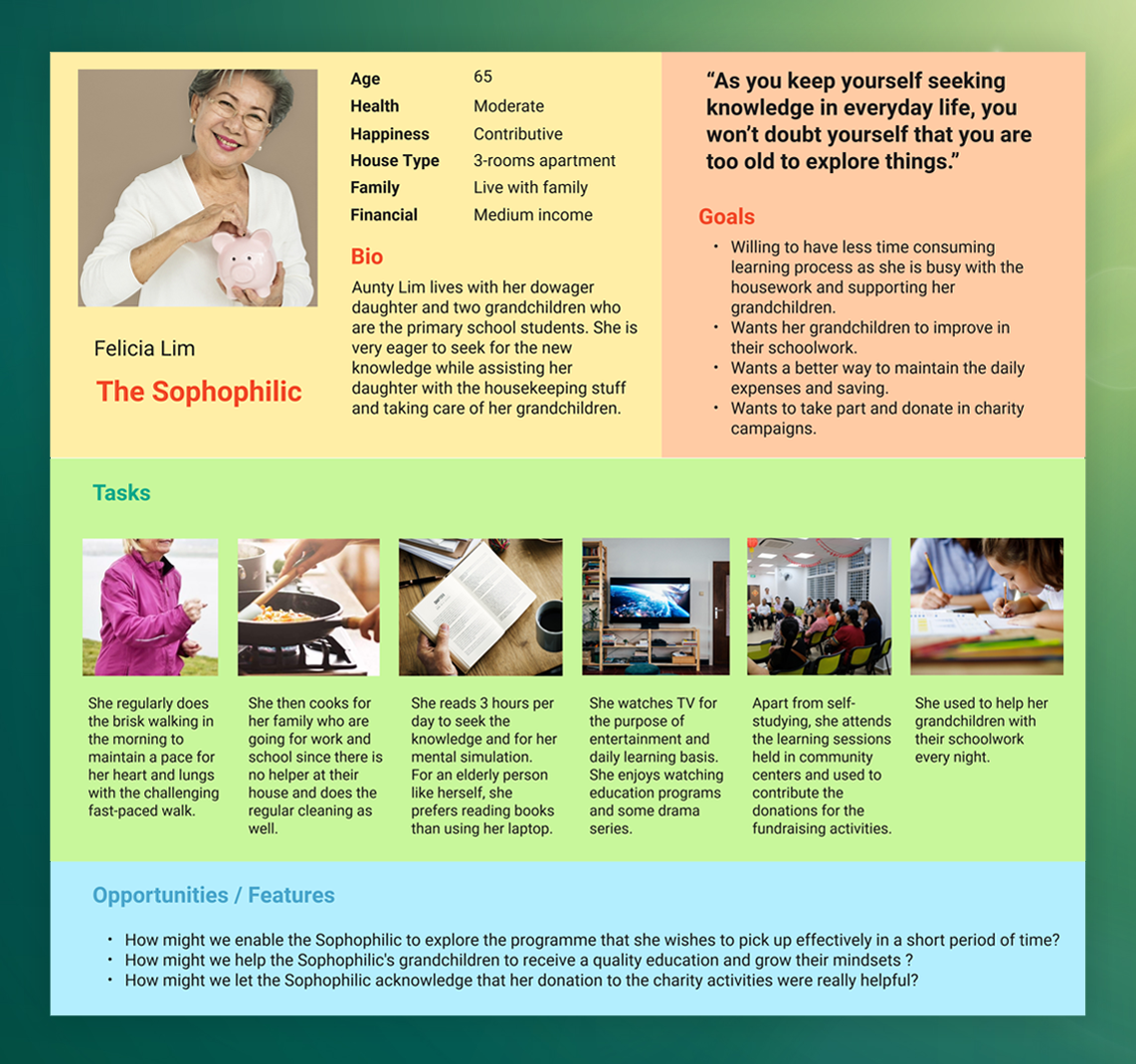
Persona
Lean Survey Canvas
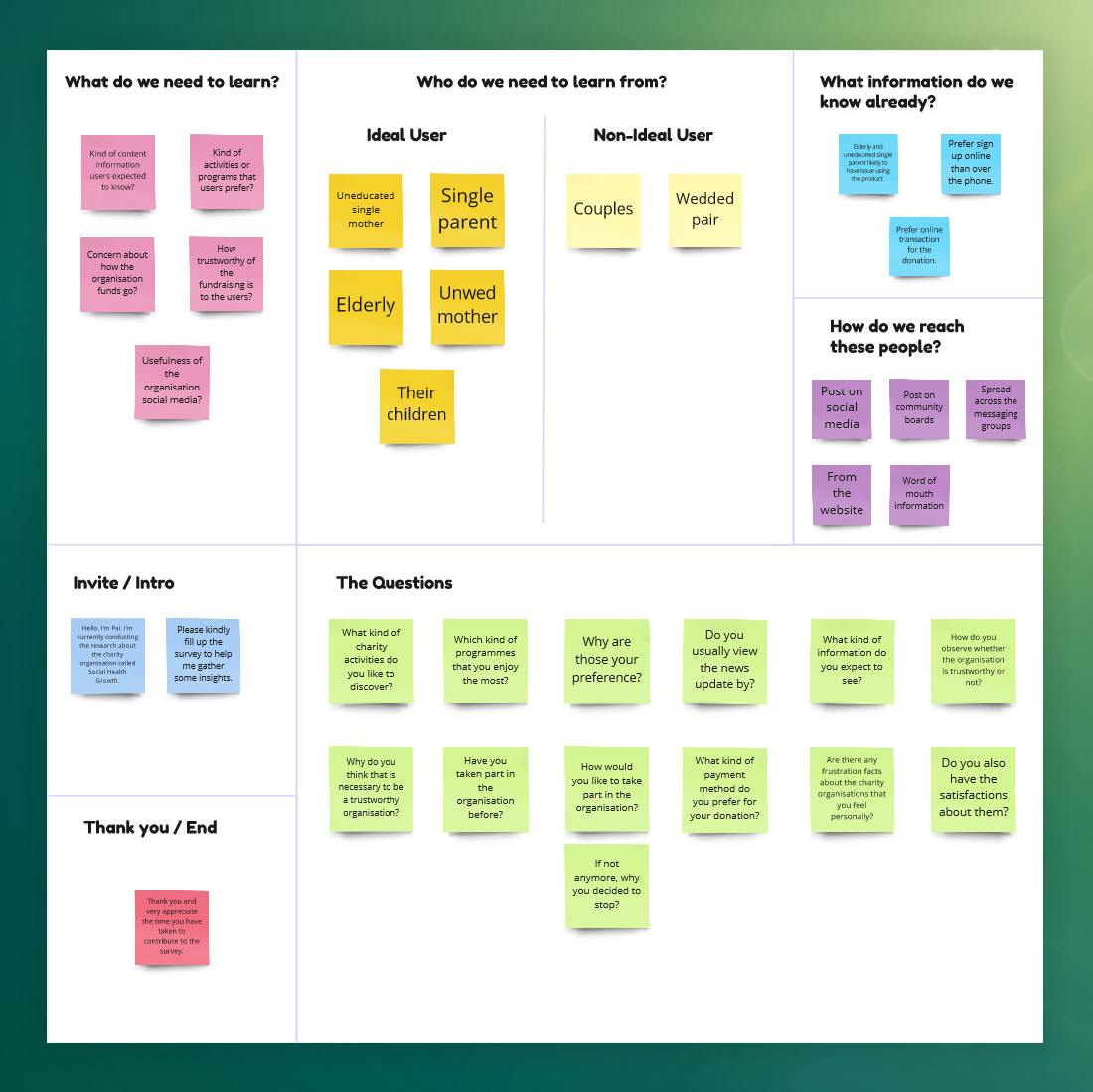
Next, the Lean Survey Canvas was generated after preparing the survey questions, and the persona was then modified based on the survey responses. The survey questions were initially designed to understand the types of charity activities and programmes users wish to discover.
After that, the survey explored how users determine the trustworthiness of an organisation, followed by questions about how they would like to participate in the organisation. The survey concluded with the frustrations and satisfaction levels personally experienced by the users.
Lean Survey Canvas
The Scope Plane
Feature Hypothesis Statement
At the Scope Plane, the Business Outcomes, User, User Outcomes, and Features were combined to form eight Feature Hypothesis Statements that help in gaining more partners, volunteers, funds, awareness, and trust.
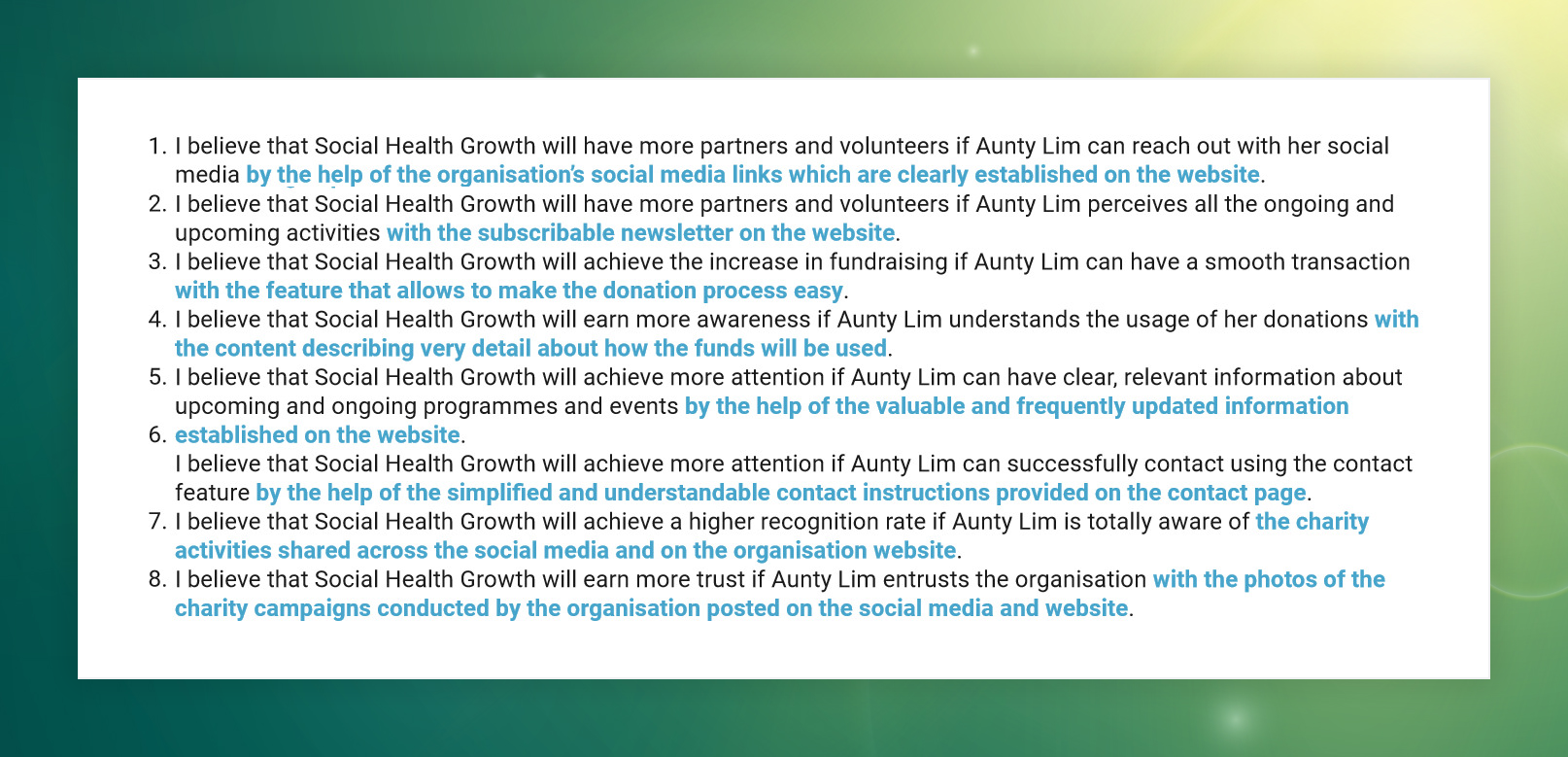
Feature Hypothesis Statements
Prioritising Hypothesis
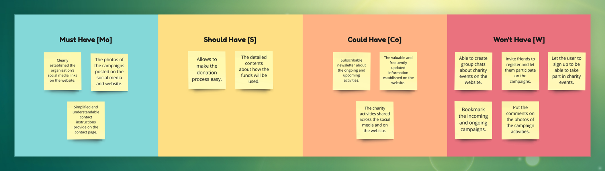
According to the Feature Hypothesis Statements, the Effort/Impact Scale was sketched to identify features that provide the highest impact with the lowest effort.
After the prioritisation process, rankings were assigned based on importance. Features requiring the least effort but offering high impact, such as increasing user awareness of the organisation’s activities, were prioritised first. Fundraising processes, which require high effort but also have high impact, were ranked accordingly. Features with the least impact and least effort, such as organisation news, were placed before those with high effort and low impact.
The prioritisation of hypotheses was finalised using the MoSCoW method, which categorises features to determine priorities.
Prioritising Hypothesis
Content Requirements
Once the Prioritising Hypothesis was completed, the existing content was listed in a table and converted into a Content Inventory. This provides a clearer view of the current content within the system. To enable improvements in the subsequent Content Audit phase, a thorough understanding of the existing content is necessary.
After compiling the Content Inventory, a Content Audit was conducted to determine whether each item should be retained, modified, or removed. The results from the Content Requirements activity are presented in a table.
Content Requirements
The Structure Plane
Five Dimensions of Interaction Design
During the interaction design phase, attention was given to words, visual representation, physical objects/space, time, and behaviour. Several points were then identified that conflicted with established interaction design principles.
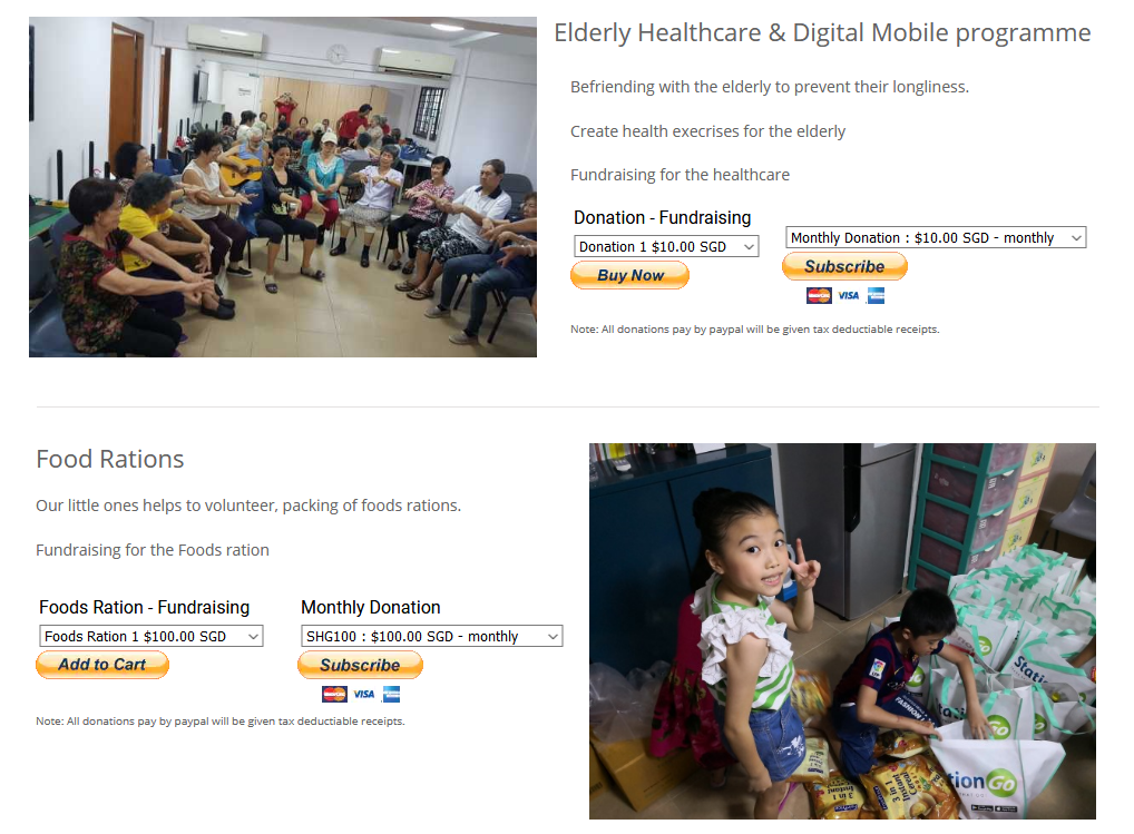
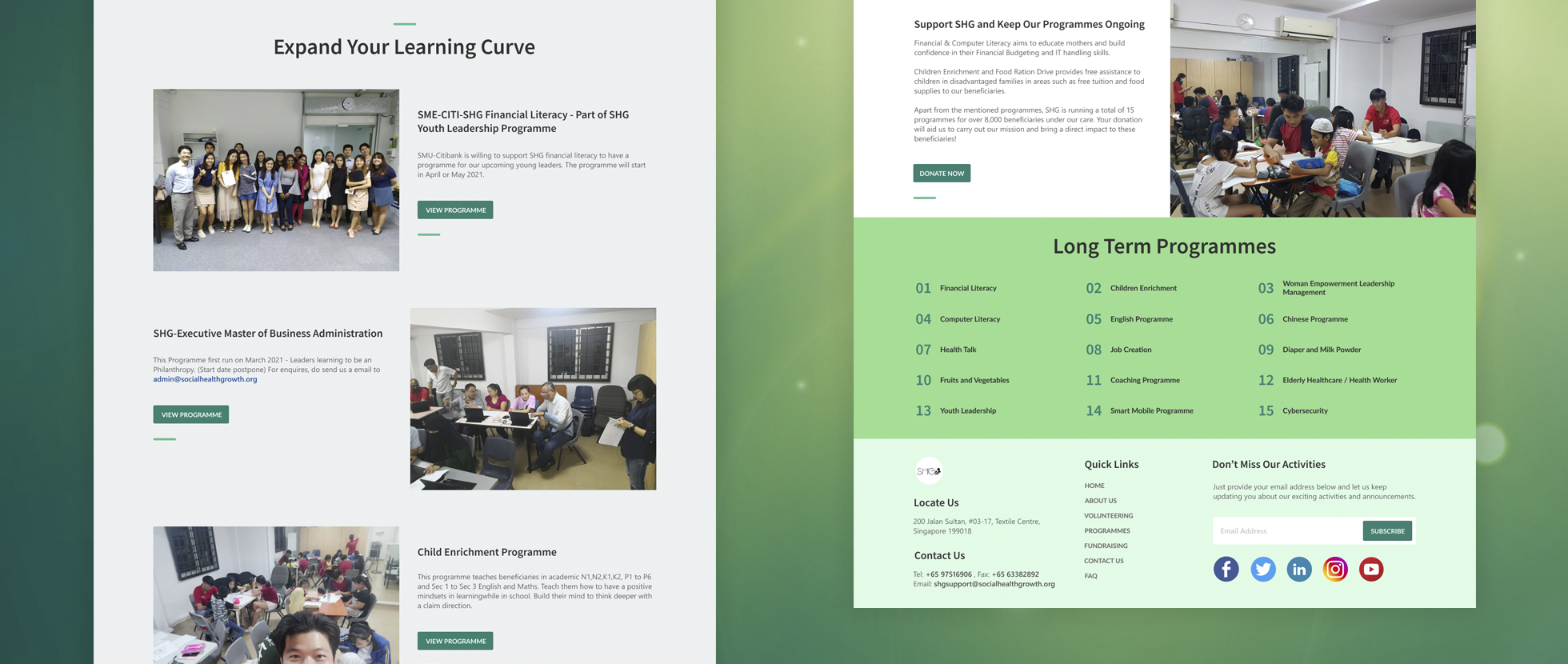
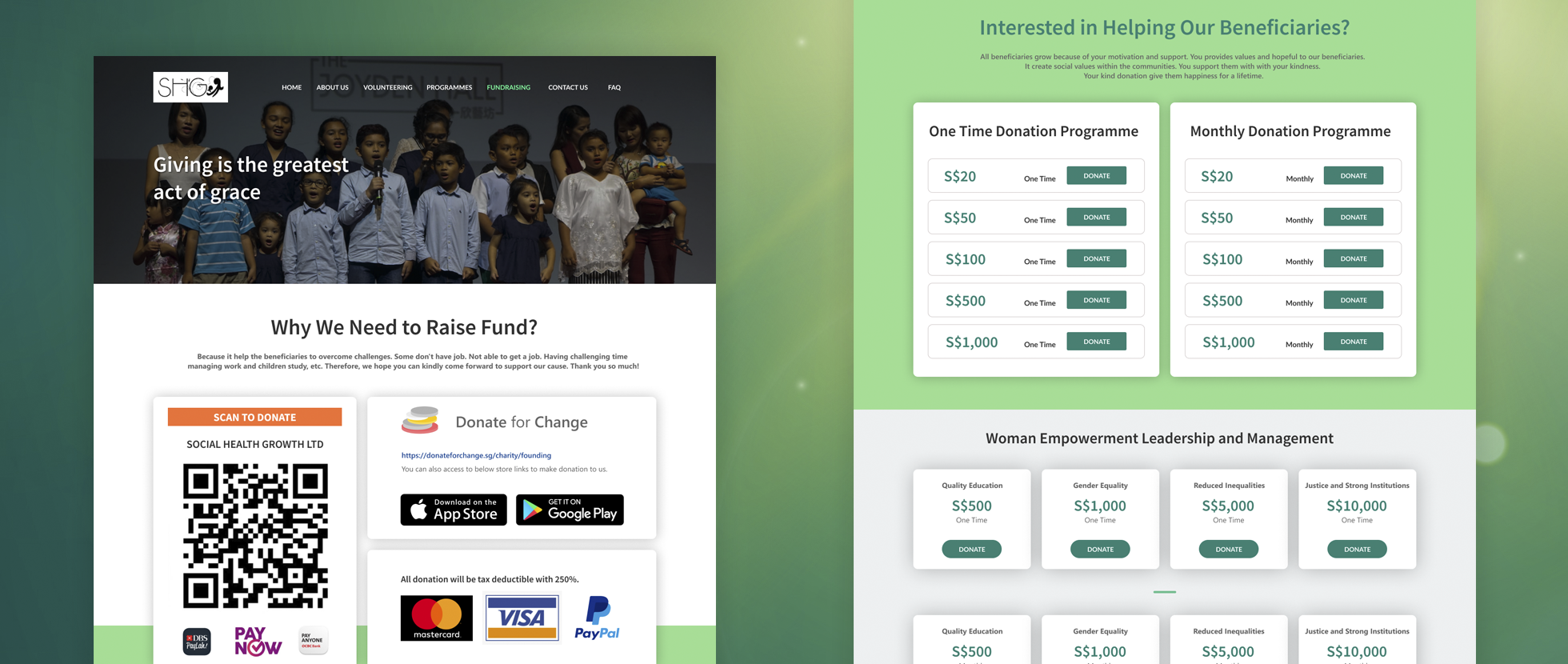
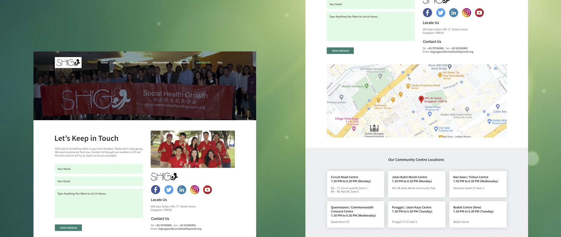
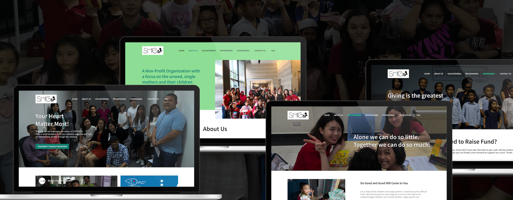
Image from Social Health Growth
Words — The terms used on the donation buttons are somewhat misleading and can be difficult to interpret.
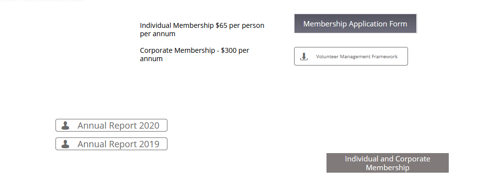
Image from Social Health Growth
Visual Representation — There is a lack of visual representation in many areas, including buttons, content, and typography. Additionally, some icons within the buttons are used incorrectly.
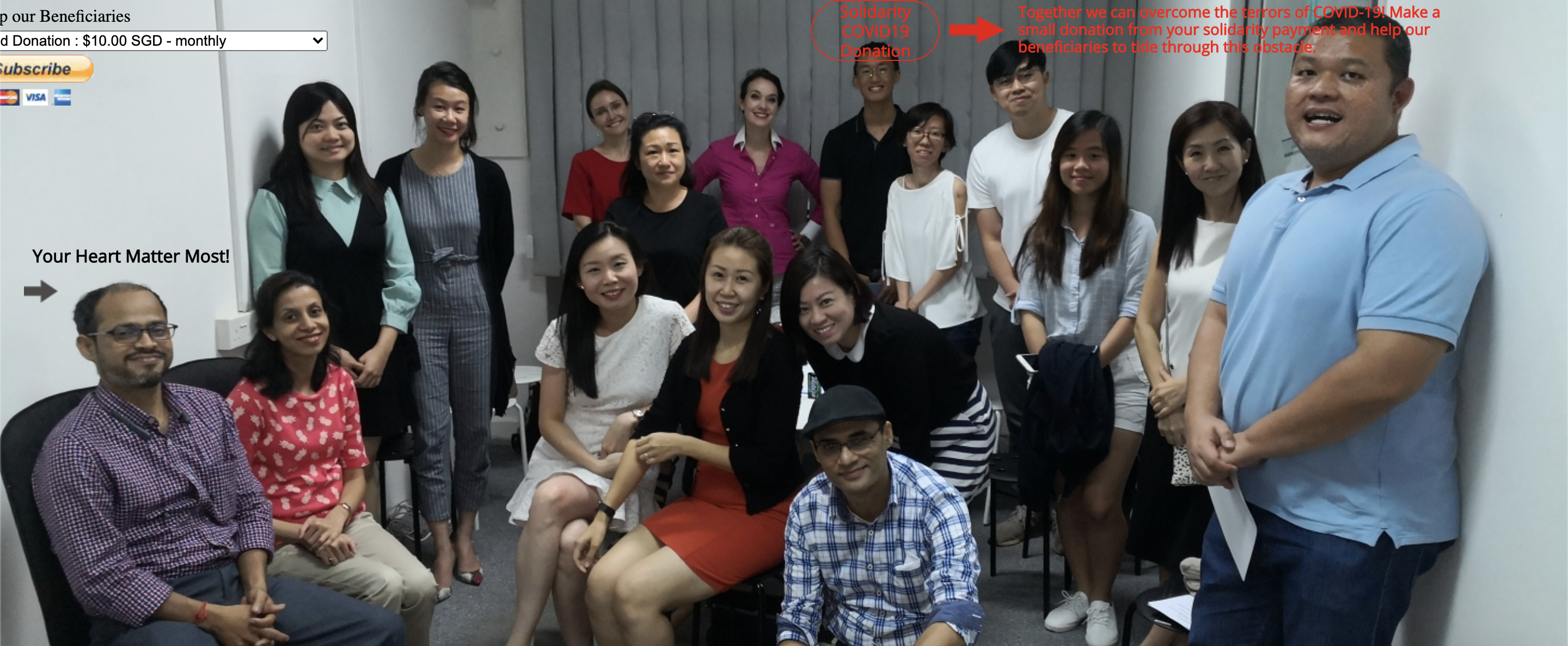
Image from Social Health Growth
Physical Objects/Space — The website is not very responsive on 13-inch screens, particularly when viewed on a MacBook.
Other than the five dimensions, it also affecting these
Consistency — Some font styles are inconsistent and difficult to read, and button styles also need to be standardised.
Perceivability — Button styles are not only inconsistent but also misleading in terms of clickability. The contact form overlaps, making it difficult for users to submit, and some buttons blend into the background images.
Predictability — The explanation of the donation features leaves users uncertain about whether to subscribe, buy now, or add to cart.
The Information Architecture
The purpose of applying Information Architecture is to make valuable content easily accessible to users. It's giving chances to the users to focus mainly on their tasks without the need of finding their way.
Card Sorting
Card Sorting was conducted with three participants to identify the easiest way for users to find what they need quickly. Navigation items and their contents were found to be scattered and poorly categorised, with donation functions confusingly placed under separate navigation items. Irrelevant content was also observed throughout the site. The final outcome of the Card Sorting will help provide users with a well-organised structure.
Card Sorting
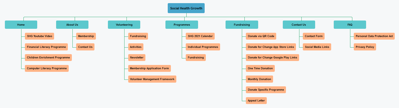
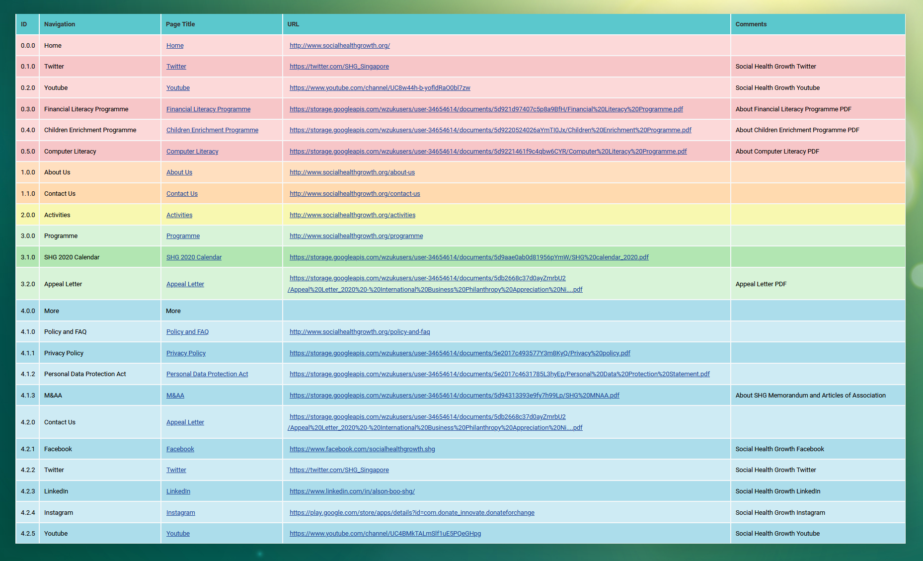
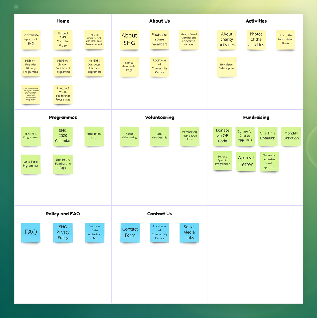
Sitemapping
At the final phase of the Structure Plane, a Sitemap was created with primary pages and subpages to represent the navigation accessible to users in a hierarchical format. This aids in improving the navigation structure and provides a clear understanding of where each page navigation should be placed.